Coolwalk is the biggest Android Auto update in a very long time. It comes with a massive interface redesign, allowing users to run multiple apps side-by-side on the same screen.
Previously, such features were available exclusively on head units with a wide resolution.
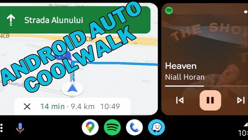
On Coolwalk, the screen size and the aspect ratio no longer matter, as the redesign splits the home screen into multiple cards. Each card goes to a certain app category, making it possible to have multiple apps on the same screen at any time.
Long-time Android Auto users certainly know this is huge. By having more than one app on the screen while driving, users wouldn't need to interact with Android Auto as often as before. This helps reduce distraction, making the experience behind the wheel safer.
The new Android Auto interface is indeed different, but it's just a matter of time until you get used to it. I’ve seen people complaining of various issues with Coolwalk, some of them eventually trying to go back to the old UI. This isn't possible in a straightforward way, as Google does not offer a dedicated switch to enable and disable Coolwalk. The company is in charge of the whole thing, and once enabled, it's fairly difficult for the Average Joe to go back to the original Android Auto version.
The new dashboard screen is the first thing you'll see when launching Coolwalk.
If you've ever used CarPlay in the last 12 months or so, you're probably familiar with this look. Sure enough, Google has brought its own visual treatment to this feature, but the concept that powers the multi-app view is the same as on CarPlay.
Apps run in cards, and each app category receives one. The navigation card is the largest and closest to the driver by default. The reasoning is simple: drivers must look at the navigation app to see the route. With the largest card, the navigation app can display more information, be it Google Maps, Waze, or any other alternative. Furthermore, the data is easier to read, and the visual route guidance is displayed in a clear way.
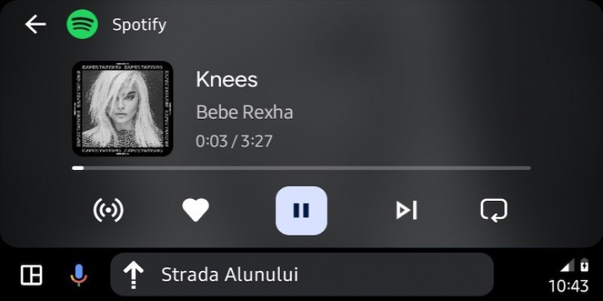
Phone calls and audio apps use smaller cards displayed in the remaining screen estate. The music card shows the music playback controls, along with album artwork (which may or may not work properly).
Each card supports touch input, and when tapped, they launch the full app. In other words, if you want to switch from the navigation card to the full version of Google Maps, it's enough to tap the app on Coolwalk. Google Maps should then load in full screen, just like in the previous version of Android Auto.
Google also redesigned the rest of the Android Auto UI. The status bar at the top of the screen is gone, so the search giant moved all details to the taskbar at the bottom. The weather information is available in a dedicated weather card exclusively displayed on portrait screens and also coming to landscape units in the coming updates.
The top right corner is known as the status area (the naming makes perfect sense, given that it displays the information originally displayed in the status bar). It has the same role as the system tray on a Windows computer – to show the time, the phone battery status, and the signal strength. Additionally, Android Auto also shows a circle with a number in it whenever the notification center has content that needs your attention. The number in the center changes depending on how many missed calls, messages, or alerts are currently in the notification center. If you want to access the notification center, all you have to do is to tap the circle.
The app icons in the taskbar follow a very simple policy. The first three icons are designated to three app categories: navigation, media, and phone calls. They always display the most recently used app from these categories. The fourth icon shows any other app that was on the screen.
If you want to see the Waze icon instead of Google Maps, you must bring Waze into focus. The latest navigation app that you use on Android Auto always appears as the first icon in the dock at the bottom of the screen.
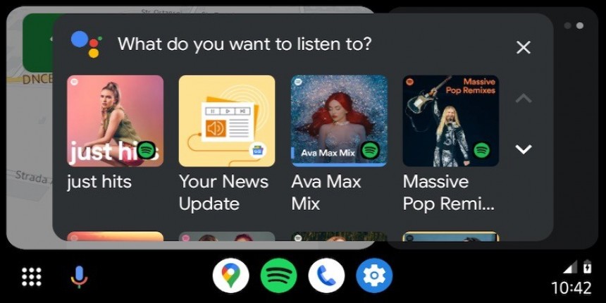
The left corner of the Coolwalk UI is the home of the app launcher and the microphone. If you've used Android Auto before, you probably know already that Android Auto integrates voice commands. Tapping the microphone launches this feature, though the same thing is possible by saying "Hey, Google" or pressing the steering wheel's voice command button.
The app launcher loads the traditional app drawer on Android Auto, where you can see all apps available in the car. This view was previously the default screen in Android Auto before Coolwalk, so most users should already be familiar with it.
On Coolwalk, the screen size and the aspect ratio no longer matter, as the redesign splits the home screen into multiple cards. Each card goes to a certain app category, making it possible to have multiple apps on the same screen at any time.
Long-time Android Auto users certainly know this is huge. By having more than one app on the screen while driving, users wouldn't need to interact with Android Auto as often as before. This helps reduce distraction, making the experience behind the wheel safer.
The new Android Auto interface is indeed different, but it's just a matter of time until you get used to it. I’ve seen people complaining of various issues with Coolwalk, some of them eventually trying to go back to the old UI. This isn't possible in a straightforward way, as Google does not offer a dedicated switch to enable and disable Coolwalk. The company is in charge of the whole thing, and once enabled, it's fairly difficult for the Average Joe to go back to the original Android Auto version.
If you've ever used CarPlay in the last 12 months or so, you're probably familiar with this look. Sure enough, Google has brought its own visual treatment to this feature, but the concept that powers the multi-app view is the same as on CarPlay.
Apps run in cards, and each app category receives one. The navigation card is the largest and closest to the driver by default. The reasoning is simple: drivers must look at the navigation app to see the route. With the largest card, the navigation app can display more information, be it Google Maps, Waze, or any other alternative. Furthermore, the data is easier to read, and the visual route guidance is displayed in a clear way.
Phone calls and audio apps use smaller cards displayed in the remaining screen estate. The music card shows the music playback controls, along with album artwork (which may or may not work properly).
Google also redesigned the rest of the Android Auto UI. The status bar at the top of the screen is gone, so the search giant moved all details to the taskbar at the bottom. The weather information is available in a dedicated weather card exclusively displayed on portrait screens and also coming to landscape units in the coming updates.
The top right corner is known as the status area (the naming makes perfect sense, given that it displays the information originally displayed in the status bar). It has the same role as the system tray on a Windows computer – to show the time, the phone battery status, and the signal strength. Additionally, Android Auto also shows a circle with a number in it whenever the notification center has content that needs your attention. The number in the center changes depending on how many missed calls, messages, or alerts are currently in the notification center. If you want to access the notification center, all you have to do is to tap the circle.
The app icons in the taskbar follow a very simple policy. The first three icons are designated to three app categories: navigation, media, and phone calls. They always display the most recently used app from these categories. The fourth icon shows any other app that was on the screen.
The left corner of the Coolwalk UI is the home of the app launcher and the microphone. If you've used Android Auto before, you probably know already that Android Auto integrates voice commands. Tapping the microphone launches this feature, though the same thing is possible by saying "Hey, Google" or pressing the steering wheel's voice command button.
The app launcher loads the traditional app drawer on Android Auto, where you can see all apps available in the car. This view was previously the default screen in Android Auto before Coolwalk, so most users should already be familiar with it.


