Google Maps has dominated the mobile space for many years, but it's not a secret that the application isn't everybody's favorite cup of tea.
People have been trying to find alternatives for a long time, but most end up coming back to Google Maps for a simple reason. It's the only application with incredible map accuracy, support for most platforms, and a freeware license. You get everything without a fee, including offline maps, voice navigation, Google Assistant integration, and support for walking and public transportation.
Critics have recently received a new reason to dump Google Maps. The updated color palette, whose rollout was completed in November, wasn't received well by Google Maps' vast user base, with many people claiming the navigation app looks too much like Apple Maps.
But leaving aside the similarities between the two mapping platforms, the most important complaint is related to how users can distinguish the information on the screen.
Google Maps now uses new colors, including teal for water, mint for parks and forests, and grey for roads. The idea behind the update was to make Google Maps more readable, and at some level, this objective was achieved. The grey roads are much easier to observe when looking at the map.
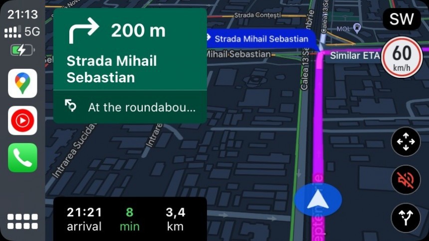
However, everything changes when navigation is enabled, especially in dark mode. I already told you why running Google Maps with the dark visual style is a major challenge on CarPlay, but you can easily understand my frustration by quickly checking out the screenshot below.
Following the suggested route is more difficult by glancing at the screen, as Google Maps now uses different shades of blue to highlight it on the map. In some cases, the app's instructions and the information it throws at the user cover the highlighted route, so drivers end up staring at the screen for more than one second.
Google's changes, now available for all, defeat Google Maps' purpose of making every moment spent behind the wheel safer and more convenient. By taking their eyes off the road and trying to understand what Google Maps says, drivers become more distracted.
The information presented by Google Maps should be clear and straightforward, and the active route should be clearly highlighted on the map. I believe this is the biggest problem in the new color palette, and while some people don't like the interface because it's ugly, the poor choice of colors in the dark mode makes Google Maps dangerous while driving.
The easiest way to resolve this shortcoming is to change how the application highlights the active route on the map.
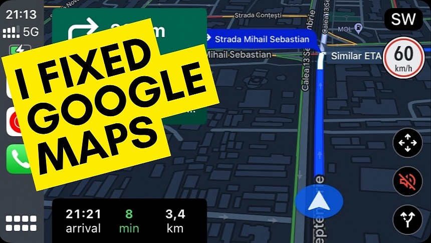
Google has so far remained tight-lipped on the feedback it received after rolling out the new Google Maps interface, so I decided to take the matter into my own hands and see how hard it'd be to make this change. I'm not a professional photo editor, and you can easily tell my skills aren't the best by opening the image below, but here's how easy it'd be for Google to address this problem.
It took me less than one minute to change the color in this screenshot, and I don't think the company's highly qualified designers and engineers would need more than that to make it happen. It's a small but mandatory change that Google should integrate into Google Maps, not only in the dark mode but also in the light visual style.
The company can use any colors it wants, as the goal is to make the active route easily distinguishable on the screen. By making it readable, drivers can figure out where they are and where their next turn is located just by glancing at the screen. It takes a second to do this if the color highlighting the route stands out from the interface.
Unfortunately, Google has remained tight-lipped on all the criticism received after rolling out the new Google Maps interface, and it doesn't look like the company is interested in rolling out further refinements. However, users aren't willing to give up on the fight, so they try to make themselves heard on every occasion.
Many have turned to Google Maps' Play Store listing to express their thoughts regarding the new color palette. The app's rating has declined significantly lately, as it's been flooded with one-star reviews by people who believe the new interface is ugly. Others have started petitions, calling for Google to make the new interface optional.
Eventually, Google might ignore all these requests, hoping that users would get used to the interface in the long term. Maybe they will, maybe they won't, but at the end of the day, it's not only a matter of aesthetics. The new Google Maps is much more difficult to use, sometimes even becoming dangerous, so the search giant should take notice and find a way to resolve this shortcoming with refinements that wouldn't require more than a couple of minutes.
Critics have recently received a new reason to dump Google Maps. The updated color palette, whose rollout was completed in November, wasn't received well by Google Maps' vast user base, with many people claiming the navigation app looks too much like Apple Maps.
But leaving aside the similarities between the two mapping platforms, the most important complaint is related to how users can distinguish the information on the screen.
Google Maps now uses new colors, including teal for water, mint for parks and forests, and grey for roads. The idea behind the update was to make Google Maps more readable, and at some level, this objective was achieved. The grey roads are much easier to observe when looking at the map.
However, everything changes when navigation is enabled, especially in dark mode. I already told you why running Google Maps with the dark visual style is a major challenge on CarPlay, but you can easily understand my frustration by quickly checking out the screenshot below.
Google's changes, now available for all, defeat Google Maps' purpose of making every moment spent behind the wheel safer and more convenient. By taking their eyes off the road and trying to understand what Google Maps says, drivers become more distracted.
The information presented by Google Maps should be clear and straightforward, and the active route should be clearly highlighted on the map. I believe this is the biggest problem in the new color palette, and while some people don't like the interface because it's ugly, the poor choice of colors in the dark mode makes Google Maps dangerous while driving.
The easiest way to resolve this shortcoming is to change how the application highlights the active route on the map.
Google has so far remained tight-lipped on the feedback it received after rolling out the new Google Maps interface, so I decided to take the matter into my own hands and see how hard it'd be to make this change. I'm not a professional photo editor, and you can easily tell my skills aren't the best by opening the image below, but here's how easy it'd be for Google to address this problem.
The company can use any colors it wants, as the goal is to make the active route easily distinguishable on the screen. By making it readable, drivers can figure out where they are and where their next turn is located just by glancing at the screen. It takes a second to do this if the color highlighting the route stands out from the interface.
Unfortunately, Google has remained tight-lipped on all the criticism received after rolling out the new Google Maps interface, and it doesn't look like the company is interested in rolling out further refinements. However, users aren't willing to give up on the fight, so they try to make themselves heard on every occasion.
Many have turned to Google Maps' Play Store listing to express their thoughts regarding the new color palette. The app's rating has declined significantly lately, as it's been flooded with one-star reviews by people who believe the new interface is ugly. Others have started petitions, calling for Google to make the new interface optional.
Eventually, Google might ignore all these requests, hoping that users would get used to the interface in the long term. Maybe they will, maybe they won't, but at the end of the day, it's not only a matter of aesthetics. The new Google Maps is much more difficult to use, sometimes even becoming dangerous, so the search giant should take notice and find a way to resolve this shortcoming with refinements that wouldn't require more than a couple of minutes.


