The new Google Maps is here for everybody, but the controversy about the new color palette has reached an unexpected level.
Few users seem to like the interface update, as most believe Google Maps looks like Apple Maps, making distinguishing the information shown on the screen more complicated.
Earlier this week, a former Google Maps designer joined the conversation, highlighting the most pressing problems of the existing interface and calling for Google to simplify the experience as soon as possible.
Eventually, the UI isn't received well by any means, and someone recently shared on eBay what could easily be clear evidence of why Google must further polish the Google Maps color palette.
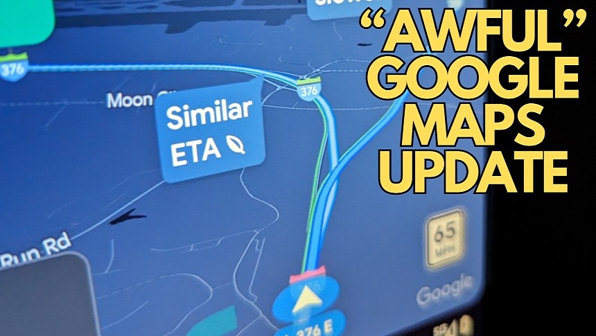
While I don't find the new Google Maps interface such a frustrating update when the light mode is active, the dark visual style makes everything much worse. It's because Google Maps is no longer readable, and telling the active route apart from the alternative routes is a significant challenge.
Everything looks much clearer in daylight mode. Google Maps now uses different shades of gray for roads, so they are clearly visible by just glancing at the screen. The dark mode doesn't meet these expectations, especially when navigation is enabled.
The screenshot shared on reddit shows that distinguishing the active route from an alternative suggestion is a major challenge at night. Both routes use a different shade of blue, and you can't even tell which route is active when looking at the screen.
The more concerning part is that users should not look at the screen for too long. What you see in this screenshot is Google Maps running on Android Auto, meaning the interface was projected on the vehicle's infotainment screen. Drivers looking at the screen, trying to figure out which way to go, is a big no-no, so with this latest update, Google Maps defeats its purpose of making the experience behind the wheel safer.
Google has so far remained tight-lipped on its controversial Google Maps update, but I believe the company will continue to further polish it in the coming updates, especially now that the rollout is complete.
The suggestions made by a former Google Maps designer will probably catch Google's attention, though I don't expect any dramatic improvements in the short term. Google must simplify the Google Maps interface, but the company won't go too far in this direction, sticking with subtle tweaks that many might even fail to notice.
Updating the color palette in the dark mode is critical, especially considering how hard it is to tell two routes apart. For now, there's not much users can do, as the interface update is based on a server-side update (so downgrading to an earlier Google Maps build is a waste of time).


