Google has recently enabled the new Google Maps interface for all users, completing the rollout of the controversial color palette on mobile and the web.
It's not a secret that users worldwide received the updated Google Maps look with mixed reactions. While some believe the new colors help better distinguish roads, eventually making navigation more straightforward, others call the interface update "an abomination."
Elizabeth Laraki, who in 2007 was one of the only two Google Maps designers, explained on X that the new design "feels colder, less accurate, and less human."
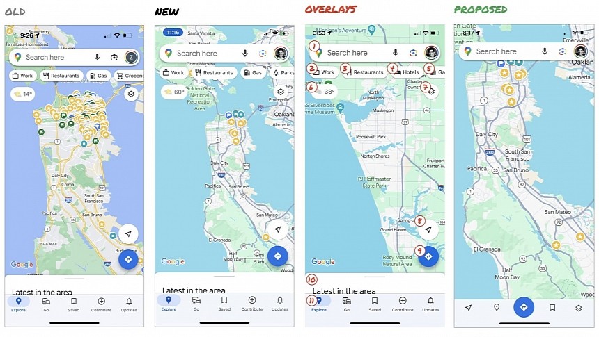
The facelift is primarily centered around the new color palette, pushing Google Maps closer to Apple Maps from a map color perspective. The roads now use different shades of gray, while parks and forests appear with a mint green color on Google Maps. The water is no longer blue but teal.
Google's purpose was to make everything you see on the map more readable, but for many users, Google Maps became more difficult to use. The interface feels like it's "computer generated," Laraki explained.
The Google Maps interface problems don't come down to the new color palette exclusively.
Laraki goes on to highlight the cluttered Google Maps interface, explaining that the interface contains 11 elements that obscure the maps, which, in her opinion, should be "sacred real estate" in such an application.
The former Google Maps designer, who also worked on other popular Internet services, including Facebook and YouTube, proposes a simplified design that keeps only the search box and the bottom bar on the screen, removing everything else from the map. This way, Google Maps would put the map at the core of its experience, moving the most-used features to the bottom bar. The other features should be buried elsewhere in the application, Laraki explains.
The former Google employee explains that in 2007, when the work on Google Maps was focused on new features, the application quickly became "a cluttered mess." The primary objective wasn't to make Google Maps easy to use but to integrate as many new features as possible "into any space we could find in the UI."
Eventually, the user experience was dramatically impacted, so using the app was complicated and frustrating. "We had to rethink the app to be simple," she explains, emphasizing that it's time for Google to do the same thing with the existing version of Google Maps.
Users seem to agree, as the post-update feedback calls for Google to simplify the application and focus on improvements that make using Google Maps more straightforward and convenient.
I agree with these points, as Google Maps is all about maps, and the application could hide all the unnecessary items under a gesture or in the bottom bar. Until Google understands that focusing on the core capability of the app should be a priority, users will continue to search for alternatives, with Apple Maps likely to become a more intriguing solution.
15 years ago, I helped design Google Maps.
— Elizabeth Laraki (@elizlaraki) November 22, 2023
I still use it everyday.
Last week, the team dramatically changed the map’s visual design.
I don’t love it.
It feels colder, less accurate and less human.
But more importantly, they missed a key opportunity to… pic.twitter.com/HMcpKiOEdr


