Google has recently started the rollout of its most controversial Google Maps update in a long time, as it wants the maps to look modern and fresh.
The company refreshed the color palette within the app, changing the traditional map colors to new shades that somehow push Google Maps closer to Apple Maps. Google uses new green, blue, and grey shares in Google Maps, likely as it wants to provide richer details on its maps.
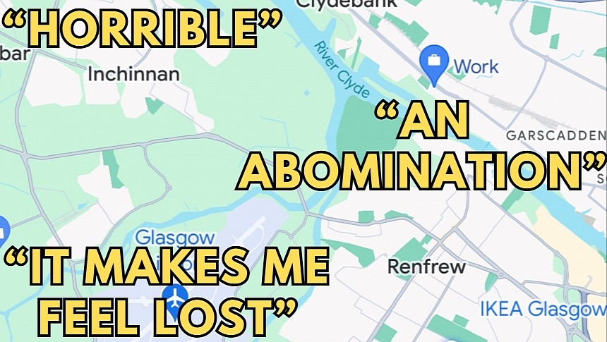
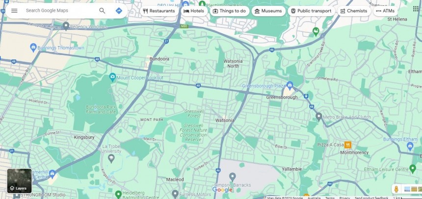
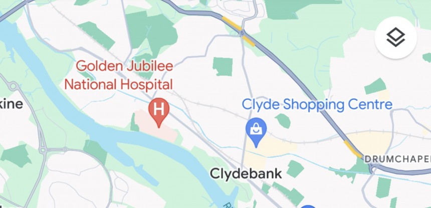
However, the new maps make certain elements harder to distinguish. The green areas, typically forests and parks, are harder to distinguish from water unless you zoom in. The roads are more visible, given they're now grey, but otherwise, the maps look unrealistic.
The rollout kicked off in August, but the process is now gaining pace, reaching more users (possibly as Google accelerated the release beginning on September 1).
Unsurprisingly, not everybody is a big fan of the facelift.
Users who turned to Google's forums for feedback criticize the new look, explaining – sometimes in harsh terms – that Google Maps is now much harder to use.
The first report was posted four days ago when someone turned to the forums believing something was wrong on their side. "Not sure what exactly I did," they said, thinking it was a bug on their side. The purpose of the post was to ask for help in bringing Google Maps back to the original color scheme.
It was only a matter of time until other people confirmed the new color palette, making it clearer that Google was rolling out a new interface for Google Maps.
Most people – the original post has 55 upvotes, but several other threads include similar complaints – encourage everybody to send feedback to convince Google that its new design is ugly. "I'm lost in my surroundings now because I can't adapt to the new scheme," someone says.
Users want Google to introduce a switch that allows them to choose between the old and the new interface. While the search giant has remained tight-lipped on the interface update and its rollout plans, I doubt it'll provide users with such a toggle. The company typically introduces an option to enable the new design to make the transition smoother (it happened with Gmail and a couple of other Google services), but eventually, it still enables the update for everybody, whether they want it or not.
Others have tried all kinds of workarounds to get back the old color scheme. Someone even restored it by downgrading Google Maps on Android to an earlier version. However, it is worth knowing that the new interface is powered by a server-side switch, so it's not directly tied to a specific Google Maps version. Google enables the new maps gradually for its users, so even if you downgrade, the new maps will still appear again eventually.
"It looks like the '90s," someone explains, adding that the previous colors were "the best in the industry."
Google Maps seems to follow in Apple Maps' footsteps, adopting more vivid colors. However, most people believe the new maps sport lower contrast, which makes it harder for them to distinguish the elements on the screen.
In my time with the new Google Maps, I noticed that distinguishing roads from the background is easier when using the maps at the maximum zoom level. On the other hand, if you zoom out to explore a region, it's almost impossible to distinguish a road from the background or see a forest without zooming back in.
The struggle to do this "hurts the brain," one user explains, while someone else calls the new Google Maps look "an abomination."
One user claims they reached out to Google to ask for a way to return to the previous maps, but they've been told this is the new interface going forward. However, Google encouraged them to leave feedback, as the search giant wants to hear from its users if the new color palette is a good choice.
In the meantime, Google looks like it's feeling the pressure from Apple Maps. The iPhone maker will soon release a major Apple Maps update that adds offline maps, allowing users to navigate without an Internet connection. Similar functionality has been available in Google Maps for many years, but the addition of offline maps signals Apple's commitment to improve Apple Maps and turn it into the preferred navigation solution on its platform.
Apple is also working on more detailed maps with rich details, such as 3D buildings, street signs, traffic lights, crosswalks, sidewalks, and trees. All these updates are part of a so-called detailed city experience now rolling out worldwide. The new Apple Maps goes live in stages, with the parent company expected to share additional information in this regard at the September 12 event when it announces the iPhone 15 and its new iOS 17 operating system update.
However, the new maps make certain elements harder to distinguish. The green areas, typically forests and parks, are harder to distinguish from water unless you zoom in. The roads are more visible, given they're now grey, but otherwise, the maps look unrealistic.
The rollout kicked off in August, but the process is now gaining pace, reaching more users (possibly as Google accelerated the release beginning on September 1).
Unsurprisingly, not everybody is a big fan of the facelift.
Users who turned to Google's forums for feedback criticize the new look, explaining – sometimes in harsh terms – that Google Maps is now much harder to use.
It was only a matter of time until other people confirmed the new color palette, making it clearer that Google was rolling out a new interface for Google Maps.
Most people – the original post has 55 upvotes, but several other threads include similar complaints – encourage everybody to send feedback to convince Google that its new design is ugly. "I'm lost in my surroundings now because I can't adapt to the new scheme," someone says.
Users want Google to introduce a switch that allows them to choose between the old and the new interface. While the search giant has remained tight-lipped on the interface update and its rollout plans, I doubt it'll provide users with such a toggle. The company typically introduces an option to enable the new design to make the transition smoother (it happened with Gmail and a couple of other Google services), but eventually, it still enables the update for everybody, whether they want it or not.
Others have tried all kinds of workarounds to get back the old color scheme. Someone even restored it by downgrading Google Maps on Android to an earlier version. However, it is worth knowing that the new interface is powered by a server-side switch, so it's not directly tied to a specific Google Maps version. Google enables the new maps gradually for its users, so even if you downgrade, the new maps will still appear again eventually.
"It looks like the '90s," someone explains, adding that the previous colors were "the best in the industry."
Google Maps seems to follow in Apple Maps' footsteps, adopting more vivid colors. However, most people believe the new maps sport lower contrast, which makes it harder for them to distinguish the elements on the screen.
In my time with the new Google Maps, I noticed that distinguishing roads from the background is easier when using the maps at the maximum zoom level. On the other hand, if you zoom out to explore a region, it's almost impossible to distinguish a road from the background or see a forest without zooming back in.
One user claims they reached out to Google to ask for a way to return to the previous maps, but they've been told this is the new interface going forward. However, Google encouraged them to leave feedback, as the search giant wants to hear from its users if the new color palette is a good choice.
In the meantime, Google looks like it's feeling the pressure from Apple Maps. The iPhone maker will soon release a major Apple Maps update that adds offline maps, allowing users to navigate without an Internet connection. Similar functionality has been available in Google Maps for many years, but the addition of offline maps signals Apple's commitment to improve Apple Maps and turn it into the preferred navigation solution on its platform.
Apple is also working on more detailed maps with rich details, such as 3D buildings, street signs, traffic lights, crosswalks, sidewalks, and trees. All these updates are part of a so-called detailed city experience now rolling out worldwide. The new Apple Maps goes live in stages, with the parent company expected to share additional information in this regard at the September 12 event when it announces the iPhone 15 and its new iOS 17 operating system update.


