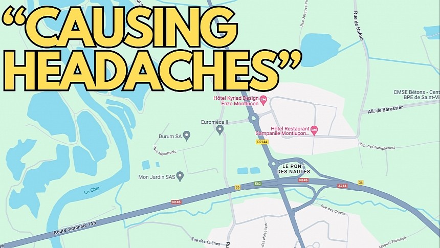
Google has recently enabled the new color palette for all Google Maps users, completing the rollout of what looks to be the most controversial update ever received by the app.
The new colors are supposed to make Google Maps more readable, as Google uses multiple shades of gray for roads, teal instead of blue for lakes, and light green for forests and parks.
Theoretically, Google's intention makes sense for a navigation app, as users can get more information about their routes by just glancing at the screen. In practice, the update needs more polishing, especially regarding the dark mode.
Users hate the new Google Maps and want the search giant to bring back the old interface. Everybody knows that's not going to happen, but users don't want to abandon the fight, so they use every option they have to make themselves heard.
After hundreds of posts on Google's support forums, Google Maps users have turned to the Google Play Store to send their feedback regarding the new colors. Unsurprisingly, the app has been plagued with bad reviews, with the number of one-star ratings skyrocketing nearly overnight.
Most people claim the "new colors are terrible," while someone else says they can't use directions because "it hurts my eyes." It happens mostly at night when Google Maps enables the dark mode – as I said, the application needs further refinements for this visual style, especially because users can't easily distinguish the active route from the alternatives highlighted on the map.
One user claims that the new colors are so bad that they're "causing me headaches," while another says that "whoever decided to change the color scheme should be fired."
The bad comments continue with people calling for Google to undo the change or make the new color scheme optional. The search giant didn't post a detailed response, as the official account sticks with a generic message that thanks users for the feedback.
Users can't do anything about the new colors, as Google enabled the update with a server-side switch, so it's not linked to a specific app version. Downgrading to an earlier build won't restore the previous colors.
Meanwhile, Google doesn't seem interested in reverting the change, despite criticism claiming that Google Maps looks too much like Apple Maps. The company has already made a choice, and Google isn't the kind of company that likes to undo the updates released for its services. It's probably a matter of time until everybody gets used to the new colors, and Google knows it, too, but the application still needs further polishing.
The new color scheme is available everywhere, including on mobile devices and in the car on Android Auto and CarPlay infotainment screens.
Theoretically, Google's intention makes sense for a navigation app, as users can get more information about their routes by just glancing at the screen. In practice, the update needs more polishing, especially regarding the dark mode.
Users hate the new Google Maps and want the search giant to bring back the old interface. Everybody knows that's not going to happen, but users don't want to abandon the fight, so they use every option they have to make themselves heard.
After hundreds of posts on Google's support forums, Google Maps users have turned to the Google Play Store to send their feedback regarding the new colors. Unsurprisingly, the app has been plagued with bad reviews, with the number of one-star ratings skyrocketing nearly overnight.
Most people claim the "new colors are terrible," while someone else says they can't use directions because "it hurts my eyes." It happens mostly at night when Google Maps enables the dark mode – as I said, the application needs further refinements for this visual style, especially because users can't easily distinguish the active route from the alternatives highlighted on the map.
The bad comments continue with people calling for Google to undo the change or make the new color scheme optional. The search giant didn't post a detailed response, as the official account sticks with a generic message that thanks users for the feedback.
Users can't do anything about the new colors, as Google enabled the update with a server-side switch, so it's not linked to a specific app version. Downgrading to an earlier build won't restore the previous colors.
Meanwhile, Google doesn't seem interested in reverting the change, despite criticism claiming that Google Maps looks too much like Apple Maps. The company has already made a choice, and Google isn't the kind of company that likes to undo the updates released for its services. It's probably a matter of time until everybody gets used to the new colors, and Google knows it, too, but the application still needs further polishing.
The new color scheme is available everywhere, including on mobile devices and in the car on Android Auto and CarPlay infotainment screens.


