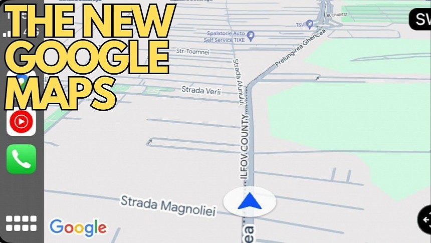
The new Google Maps colors, enabled by Google for the entire user base earlier this month, failed to produce the impact that the search giant was aiming for.
Users worldwide criticized the company for the choice of colors, claiming that instead of making Google Maps more readable, it's now insanely difficult to distinguish certain elements, including lakes and forests.
The criticism has reached impressive levels, with some users giving up on Google Maps specifically because they found the app too difficult to use, confusing, and unfamiliar.
But despite the consensus that Google Maps now looks ugly, outdated, and cold, I believe the new colors make more sense on CarPlay and Android Auto.
The reason is as simple as possible: the new colors seem to focus more on the navigation experience, and this approach fits CarPlay like a glove.
One of the biggest changes in the new Google Maps is the color of the roads. The application now shows different shades of grey, and on CarPlay, it's much easier to see the road and the other nearby streets. The interface feels more straightforward now, so you can see where the road is going much easier, and you can drive with Google Maps on the screen without navigation enabled when you are in a familiar region.
CarPlay's main objective is to make the time spent behind the wheel safer and more convenient, and Google Maps should align with this concept by making all the information it throws at the user readable. The white roads used in the previous Google Maps version didn't follow these guidelines, and switching to grey makes more sense.
Despite Google Maps feeling more natural on CarPlay, it's not always milk and honey for Apple users. The dark mode needs more refinements, especially when Google Maps suggests alternative routes. I already explained why a few days ago, but you'll understand precisely why if you drive with Google Maps navigation on the screen and turn-by-turn guidance enabled. The current and the alternate routes use different shapes of blue displayed on a dark background (when the night mode is enabled), so it could take more than a glance at the screen to understand what Google Maps tries to say.
I can only hope that Google receives the feedback and listens to it, especially considering the firm criticism coming from users worldwide. There's no way to return to the previous color palette, and now that's enabled for all users, it's also making its way to Android Auto and CarPlay. It's probably a matter of time until everybody gets used to it, but until this happens, Google should use the extra time to align the new interface with what users expect to get from the world's number one navigation app.


