Google recently completed the new Google Maps interface rollout, enabling the controversial colors for everyone on the web, Android, and iPhone.
The updated color scheme was supposed to make Google Maps feel more natural and straightforward, but the search giant achieved the opposite in many ways.
Google Maps now feels ugly, cold, and sometimes impossible to use. Stick with me to understand how awful Google Maps has become, especially when driving at night.
Google Maps' refreshed interface comes down to colors that Apple users might find familiar. Google looked at Apple and probably thought the iPhone maker's color palette was gorgeous, so it decided to copy its rival's idea and bring a similar look to Google Maps.
The result makes sense with the light visual style but is a horrible refresh when the dark mode is enabled.
Google uses multiple shades of grey for roads, teal for water (such as lakes), and mint for forests and parks. I can hardly find this color selection a natural choice, but it somehow looks good and makes Google Maps feel more modern.
Following the suggested route is easy, as users can see the map highlights and the nearby roads more conveniently. This happens when the daytime mode is enabled, so the navigation experience gets a welcome facelift on mobile devices and infotainment screens with Android Auto or CarPlay.
I've always been a fan of dark modes, and if you're a tech-savvy user, you probably know that this visual style is the latest trend in the software world. Everybody updates their software with a dark mode; even Windows and macOS now sport such a theme.
Google Maps integrates a dark mode, too, and it makes sense. The application must feel comfortable to use when driving at night, so looking at a black screen instead of a white interface reduces the glare and doesn't make the driver temporarily blind.
I use all my navigation apps with an automatic setting, so they keep the daytime visual style when driving during the day and automatically switch to the dark mode when the car's light sensor turns on the headlights.
The new color palette makes Google Maps' dark mode a painful mess.
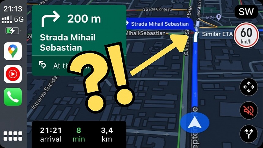
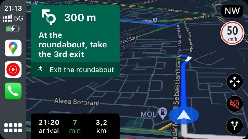
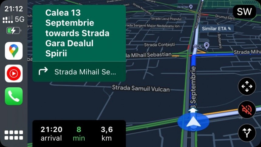
The screenshots I included in this story were captured a few minutes ago while driving home from the Christmas market. I knew the route but typically keep the navigation app on the screen for additional information on things I should know about, such as accidents, closed roads (which are more common during the holiday season due to Christmas markets), speed traps, and so on.
My favorite choices are Waze and Google Maps, and I sometimes use both simultaneously. I enable navigation in Google Maps and keep Waze running in the background, as it can show traffic reports on top of any other application running on the screen.
The experience with the new Google Maps in the dark mode is painful. Following the suggested route is a huge challenge, mainly because you can no longer see where it's going. You must look at the screen for more than a couple of seconds, which is dangerous, not recommended, and a big no-no. I used to only glance at the screen to see the highlighted route, and Google Maps now forced me to check the display regularly as I couldn't tell where the next turn was located.
The dark mode now feels cluttered and less straightforward. It's exactly what a navigation app should avoid, as such software should make driving more convenient at all times, including at night. Ironically, Google Maps felt more natural before the Mountain View-based search giant released the update supposed to make it feel more natural.
I never liked Waze's cartoonish interface, as it looks like a navigation app drawn by my kid without modern design elements. However, its dark mode is now cleaner and more straightforward, so instead of keeping Google Maps on the screen, I'll switch to Waze full-time due to this horrible update.
I'm not the only one who criticized Google for this update, and while I originally thought that getting used to the new color palette was a matter of time, I now think that using the application with the dark mode is dangerous. I can't see myself using Google Maps with the dark visual style in the long term unless the company releases major refinements, so for now, my workaround is going back to Waze.
Before you ask, you can't go back to the previous Google Maps colors, so you'll have to stick with this awful new interface. Downgrading to an earlier Google Maps version doesn't make a difference, as the new UI was enabled with a server change.
It's impossible to tell if Google is interested in this feedback, but I can only hope the company listens to its users; otherwise, I can't imagine how people will use the navigation app with the dark mode in their cars.
Google Maps now feels ugly, cold, and sometimes impossible to use. Stick with me to understand how awful Google Maps has become, especially when driving at night.
The updated colors
The result makes sense with the light visual style but is a horrible refresh when the dark mode is enabled.
Google uses multiple shades of grey for roads, teal for water (such as lakes), and mint for forests and parks. I can hardly find this color selection a natural choice, but it somehow looks good and makes Google Maps feel more modern.
Following the suggested route is easy, as users can see the map highlights and the nearby roads more conveniently. This happens when the daytime mode is enabled, so the navigation experience gets a welcome facelift on mobile devices and infotainment screens with Android Auto or CarPlay.
The horrible dark mode
Google Maps integrates a dark mode, too, and it makes sense. The application must feel comfortable to use when driving at night, so looking at a black screen instead of a white interface reduces the glare and doesn't make the driver temporarily blind.
I use all my navigation apps with an automatic setting, so they keep the daytime visual style when driving during the day and automatically switch to the dark mode when the car's light sensor turns on the headlights.
The new color palette makes Google Maps' dark mode a painful mess.
The screenshots I included in this story were captured a few minutes ago while driving home from the Christmas market. I knew the route but typically keep the navigation app on the screen for additional information on things I should know about, such as accidents, closed roads (which are more common during the holiday season due to Christmas markets), speed traps, and so on.
My favorite choices are Waze and Google Maps, and I sometimes use both simultaneously. I enable navigation in Google Maps and keep Waze running in the background, as it can show traffic reports on top of any other application running on the screen.
The experience with the new Google Maps in the dark mode is painful. Following the suggested route is a huge challenge, mainly because you can no longer see where it's going. You must look at the screen for more than a couple of seconds, which is dangerous, not recommended, and a big no-no. I used to only glance at the screen to see the highlighted route, and Google Maps now forced me to check the display regularly as I couldn't tell where the next turn was located.
I never liked Waze's cartoonish interface, as it looks like a navigation app drawn by my kid without modern design elements. However, its dark mode is now cleaner and more straightforward, so instead of keeping Google Maps on the screen, I'll switch to Waze full-time due to this horrible update.
I'm not the only one who criticized Google for this update, and while I originally thought that getting used to the new color palette was a matter of time, I now think that using the application with the dark mode is dangerous. I can't see myself using Google Maps with the dark visual style in the long term unless the company releases major refinements, so for now, my workaround is going back to Waze.
Before you ask, you can't go back to the previous Google Maps colors, so you'll have to stick with this awful new interface. Downgrading to an earlier Google Maps version doesn't make a difference, as the new UI was enabled with a server change.
It's impossible to tell if Google is interested in this feedback, but I can only hope the company listens to its users; otherwise, I can't imagine how people will use the navigation app with the dark mode in their cars.


