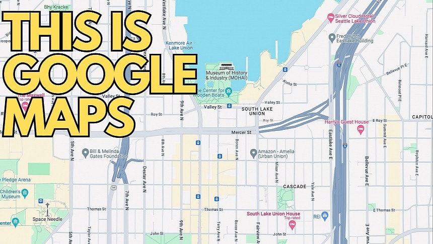
Users worldwide show incredible resistance to Google's latest Google Maps update, as the new colors, whose rollout was completed earlier this week, produced a flood of criticism online.
After taking over Google's forums with complaints regarding the new colors and expressing their feedback in reviews posted on the Play Store, users are now turning to petitions.
A change.org post calls for Google to undo the change, emphasizing that the new colors could make Google Maps more difficult to use for colorblind users.
"We urge Google to reconsider these color changes," the petition reads, eventually asking the Mountain View-based search giant to focus more on the accessibility side of Google Maps.
The new Google Maps color scheme includes different shades of gray for roads, teal for water, and mint for forests. The interface makes Google Maps look more like Apple Maps, the navigation app whose color palette is similar after the introduction of the detailed city experience.
Google hasn't yet commented on the criticism received following the debut of the Google Maps interface update, likely hoping that everybody would eventually get used to the new interface.
However, the company has been under heavy fire for the refinements brought to the Google Maps interface. A former Google Maps designer recently described the app's UI as "cold and computer-generated," highlighting all the problems that the search giant must address urgently. One of them is the cluttered interface, as the focus should be on the maps and less on unnecessary screen shortcuts for places the user might not be interested in.
The new color palette isn't tied to a specific Google Maps version, so you can't downgrade to an earlier building, hoping the update will be removed. The company enabled the new interface on all devices with a server-side switch, so you'll now find the updated color scheme on the web, iPhone, Android, Android Auto, and CarPlay.
The petition is still in its early days, having just a bunch of signatures at the time of writing. As the reader who came across the petition told me a few hours ago, it's another attempt to show Google that users aren't pleased with the updated interface, so the best thing the company can do is listen to the feedback and further polish the application.
For example, the dark mode needs urgent fixes, especially on Android Auto and CarPlay, where telling the active and the suggested routes apart is difficult and involves looking at the screen for several seconds. Google Maps should support a more straightforward experience to reduce the distraction behind the wheel. The application must offer a readable UI in all conditions, as drivers must get essential route information, including next-turn details, with a glance at the screen.


