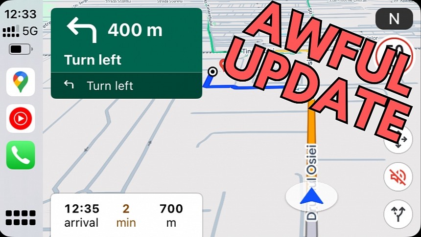
Google Maps has a new color palette, as the Mountain View-based search giant wanted to make the mapping platform more readable and easier to use while driving.
I'm with Google on this one. Google Maps needs as many improvements as possible in terms of readability, as drivers must quickly get map information and navigation directions by just glancing at the screen.
Imagine you're driving and can't figure out where to make the next. Google Maps should let you obtain this information in less than a second, as nobody can afford to take their eyes off the screen and stare at the infotainment display.
That's why Google updating the color palette makes sense. Google knows Google Maps has become an integral app for millions of drivers worldwide, so improving its interface is part of a mission to deliver an improved experience.
The problem is that Google didn't necessarily pick the best colors, eventually causing more harm than good. Using Google Maps is now a huge struggle, especially when running the app in a car on Android Auto and CarPlay.
Shortly after Google completed the rollout of its controversial update, I defended the search giant for its poor choice of colors. At that time, I told you that Google Maps feels more natural in the daytime mode, and the search firm should mostly focus on polishing the dark mode. My first hours with Google Maps on CarPlay didn't raise any particular challenges, and getting used to the new colors seemed like a matter of time.
But the more I use the new Google Maps, the more obvious it becomes that this latest update is all kinds of awful, regardless of the visual mode.
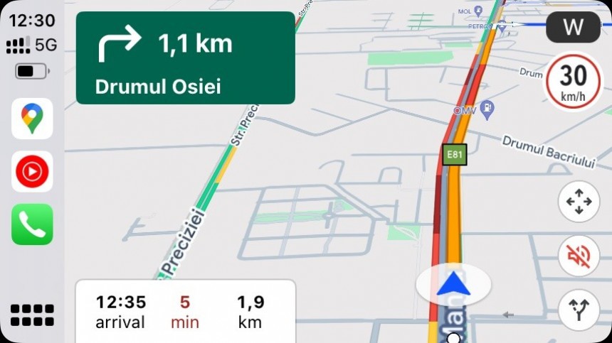
Look at this picture and tell me the first thing you notice. Google Maps no longer highlights the route, showing the traffic information directly over the route you should follow. I could hardly figure out which way to go, and the problem was that the application had me staring at the screen for more than a couple of seconds.
Oddly enough, I tried to disable the traffic information in Google Maps, but the toggle didn't work, so I couldn't see my route highlighted on the screen regardless of the settings.
Google told me to make a right turn in 1.1 kilometers, but I could hardly anticipate the turn because the route was no longer clearly highlighted on the screen. I rarely drive alone, so I keep all sounds muted in Google Maps, making the on-screen indications integral to my experience with the app. In this case, my solution was to look at the screen repeatedly to understand where I had to go right.
The same thing applies to this second example. The route is now highlighted using the color-coded traffic data, no matter if I had this setting on or off.
It takes a while to get used to this system (it's not a bug but the intended behavior), but I believe Google should take note and refine the highlighted route with a more intuitive approach that lets users clearly see which way they must go.
Now, let's move to the third and final example.
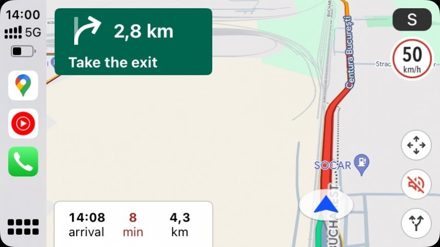
A few hours ago, I used Google Maps with the dark mode enabled (I configured the application to the automatic setting, so it switches to the dark mode when my car turns on the headlights).
You don't have to be a rocket scientist to figure out what's wrong with Google Maps in this screenshot. Google Maps told me that taking an alternative route would add eight minutes to my trip, but I couldn't even figure out the route the application was talking about. The only thing I could tell was that I had to turn right in 1.4 kilometers, but considering the horrible route highlighting method and the awkward way of marking an alternative route, my only option was to stare at the screen and try to decrypt what Google Maps was trying to tell me.
The "+8 min" tag is placed on the screen in the most awful way. The alternative route that Google believed would add more minutes to my drive was obstructed by the extra time flag, so I couldn't even figure out where it was. As a side note, Waze claimed otherwise. The other Google-owned application suggested a faster right turn, allowing me to arrive at the destination faster than using Google Maps' route.
Unfortunately, using Google Maps on CarPlay has become a major pain in the neck, and I don't believe I can stick around for too long. I'm not a big fan of Waze either, as the cartoonish interface looks like it was created by my four-year-old, but even so, it not only offers better navigation routes but also sports improved reliability. Considering Google Maps spearheads Google's mapping efforts, the search giant should urgently revise its strategy.
Imagine you're driving and can't figure out where to make the next. Google Maps should let you obtain this information in less than a second, as nobody can afford to take their eyes off the screen and stare at the infotainment display.
That's why Google updating the color palette makes sense. Google knows Google Maps has become an integral app for millions of drivers worldwide, so improving its interface is part of a mission to deliver an improved experience.
The problem is that Google didn't necessarily pick the best colors, eventually causing more harm than good. Using Google Maps is now a huge struggle, especially when running the app in a car on Android Auto and CarPlay.
Shortly after Google completed the rollout of its controversial update, I defended the search giant for its poor choice of colors. At that time, I told you that Google Maps feels more natural in the daytime mode, and the search firm should mostly focus on polishing the dark mode. My first hours with Google Maps on CarPlay didn't raise any particular challenges, and getting used to the new colors seemed like a matter of time.
But the more I use the new Google Maps, the more obvious it becomes that this latest update is all kinds of awful, regardless of the visual mode.
Oddly enough, I tried to disable the traffic information in Google Maps, but the toggle didn't work, so I couldn't see my route highlighted on the screen regardless of the settings.
Google told me to make a right turn in 1.1 kilometers, but I could hardly anticipate the turn because the route was no longer clearly highlighted on the screen. I rarely drive alone, so I keep all sounds muted in Google Maps, making the on-screen indications integral to my experience with the app. In this case, my solution was to look at the screen repeatedly to understand where I had to go right.
It takes a while to get used to this system (it's not a bug but the intended behavior), but I believe Google should take note and refine the highlighted route with a more intuitive approach that lets users clearly see which way they must go.
Now, let's move to the third and final example.
A few hours ago, I used Google Maps with the dark mode enabled (I configured the application to the automatic setting, so it switches to the dark mode when my car turns on the headlights).
The "+8 min" tag is placed on the screen in the most awful way. The alternative route that Google believed would add more minutes to my drive was obstructed by the extra time flag, so I couldn't even figure out where it was. As a side note, Waze claimed otherwise. The other Google-owned application suggested a faster right turn, allowing me to arrive at the destination faster than using Google Maps' route.
Unfortunately, using Google Maps on CarPlay has become a major pain in the neck, and I don't believe I can stick around for too long. I'm not a big fan of Waze either, as the cartoonish interface looks like it was created by my four-year-old, but even so, it not only offers better navigation routes but also sports improved reliability. Considering Google Maps spearheads Google's mapping efforts, the search giant should urgently revise its strategy.


