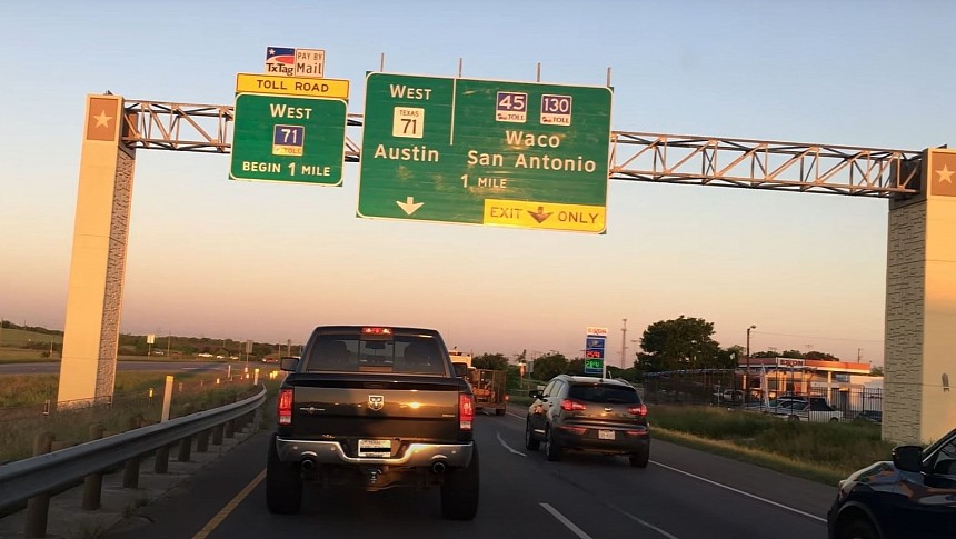
US Route 20 starts in Boston, Massachusetts, and ends in Newport, Oregon. It's America's longest highway, measuring approximately 3,365 miles. However, nobody needs to drive for almost four days to start questioning the color of the traffic signs. Sticking to the speed limit while looking at what's ahead is enough. Let's unlock that mystery.
Believe it or not, highway traffic signs haven't always been green everywhere in the US. Some states, like Arizona, experimented with different colors for different directions. For approximately a decade, the Grand Canyon State played around with blue, brown, and orange as additional colors besides green. They were supposed to tell drivers the direction they were going.
Orange was for north, blue for west, brown for east, and green for south. If your grandparents are alive, ask them what happened with Arizona's highway signs during the early '60s. They might know a thing or two!
It didn't sound bad at all initially. People relied on maps back then. They didn't have Waze or Google Maps. Letting them know that they were traveling in the right direction via the distinct color of a noticeable traffic sign was well intended. But not all experiments turn into successes. Arizona's Department of Transportation predecessor, the Highway Department, eventually stuck to green.
Nowadays, brown traffic signs are still in use. They indicate historical sites or tourist locations. But no matter the color, they're all made from aluminum stock. That should allow them to remain flexible and withstand dynamic wind loads.
So, why are all important traffic signs green now?
ADOT also says green blends better with the scenery and doesn't distract drivers. Combined with the white typeface, it helps drivers see the guide signs from afar and read them without focusing too much on what is being indicated. The contrast can also make the letters appear somewhat larger.
Besides all that, humans distinguish better between green and blue. The latter is used for signs that indicate gas stations, restrooms, or restaurants.
Fortunately, green highway traffic signs have been a national standard for quite some time, and they won't change because the green and white combo works perfectly.
A difference you might notice while traveling is the font used on these generously sized traffic signs.
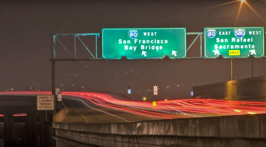
But progress doesn't wait for anyone. In the late '80s, older traffic signs were replaced with reflective indicators. That quickly turned into a problem for the popular "Highway Gothic" font. You could see that a highway sign would appear soon, but the closer you got to it, the hazier it was becoming. Blame halation for that! It's such an undesirable effect!
Light spread beyond its boundaries, making life harder for those traveling at night. Even though the weather was nice, the lettering appeared almost foggy. It was a problem for almost everyone, including those with 20/20 vision. Elderly drivers, however, were the most affected.
After another decade, experts came up with Clearview, a font that didn't have the same problem when put on reflective green highway traffic signs. That seemingly simple update gave drivers back one or two seconds of extra time to decide whether to exit the high-speed road.
That's another cool piece of trivia you can share with your guests or family this Holiday season. You can also tell them that Texas A&M researchers discovered that Clearview wasn't that much better than Highway Gothic. So, the latter made a comeback.
They were proven right in early 2016 when Clearview was taken out of service, although it's worth noting that the decision was taken on a technical basis, not because the font wasn't patriotic enough.
However, two months later, the FHA said that states can continue using Clearview. But it still pointed to a technical brief and other research studies showing that the font wasn't much better. So, it didn't require any federal support. The novel letter style wasn't that important, after all.
However, with 21 states embracing the redesigned letter style, it's complicated to argue in favor of spending more taxpayer dollars to put up new signs featuring the old font. As such, when you cross some state lines, you may see a mix of two letterings.
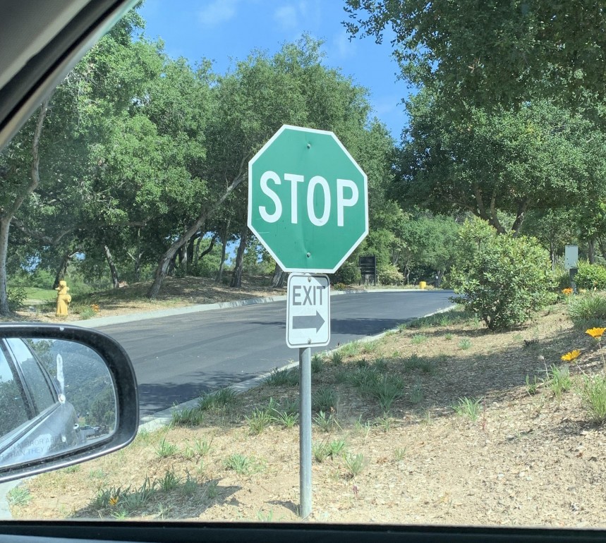
Lastly, green traffic signs can get a bit weird when you're exploring national parks or trails. You might even get to see green "STOP" signs. The Manual on Uniform Traffic Control Devices for Streets and Highways says they're not standard but can be used to match color themes on private properties and tourist places where you wouldn't even think of going over 25 mph.
Orange was for north, blue for west, brown for east, and green for south. If your grandparents are alive, ask them what happened with Arizona's highway signs during the early '60s. They might know a thing or two!
It didn't sound bad at all initially. People relied on maps back then. They didn't have Waze or Google Maps. Letting them know that they were traveling in the right direction via the distinct color of a noticeable traffic sign was well intended. But not all experiments turn into successes. Arizona's Department of Transportation predecessor, the Highway Department, eventually stuck to green.
Nowadays, brown traffic signs are still in use. They indicate historical sites or tourist locations. But no matter the color, they're all made from aluminum stock. That should allow them to remain flexible and withstand dynamic wind loads.
The intriguing story of a color
Well, according to the Arizona Department of Transportation (ADOT), green is a color that doesn't upset or distract anyone. It doesn't even make you envious!ADOT also says green blends better with the scenery and doesn't distract drivers. Combined with the white typeface, it helps drivers see the guide signs from afar and read them without focusing too much on what is being indicated. The contrast can also make the letters appear somewhat larger.
Besides all that, humans distinguish better between green and blue. The latter is used for signs that indicate gas stations, restrooms, or restaurants.
Fortunately, green highway traffic signs have been a national standard for quite some time, and they won't change because the green and white combo works perfectly.
A difference you might notice while traveling is the font used on these generously sized traffic signs.
Innovating for safety
It's not the same everywhere in America. California's Department of Transportation took the initiative and wanted a more legible typeface. It found a font friendly enough to the human eye and decided to have more space between the beefed-up letters. That was supposed to help drivers see what the indicators were saying more easily.Light spread beyond its boundaries, making life harder for those traveling at night. Even though the weather was nice, the lettering appeared almost foggy. It was a problem for almost everyone, including those with 20/20 vision. Elderly drivers, however, were the most affected.
After another decade, experts came up with Clearview, a font that didn't have the same problem when put on reflective green highway traffic signs. That seemingly simple update gave drivers back one or two seconds of extra time to decide whether to exit the high-speed road.
That's another cool piece of trivia you can share with your guests or family this Holiday season. You can also tell them that Texas A&M researchers discovered that Clearview wasn't that much better than Highway Gothic. So, the latter made a comeback.
Enjoy the mix!
But that's not why we have green highway traffic signs with different white fonts. The Federal Highway Administration (FHA) approved Clearview as an optional replacement, which means that not all states moved to change the guide signs quickly. If they didn't have to, why should they rush, right? Moreover, some consider the old font to be more American.However, two months later, the FHA said that states can continue using Clearview. But it still pointed to a technical brief and other research studies showing that the font wasn't much better. So, it didn't require any federal support. The novel letter style wasn't that important, after all.
However, with 21 states embracing the redesigned letter style, it's complicated to argue in favor of spending more taxpayer dollars to put up new signs featuring the old font. As such, when you cross some state lines, you may see a mix of two letterings.
Lastly, green traffic signs can get a bit weird when you're exploring national parks or trails. You might even get to see green "STOP" signs. The Manual on Uniform Traffic Control Devices for Streets and Highways says they're not standard but can be used to match color themes on private properties and tourist places where you wouldn't even think of going over 25 mph.


