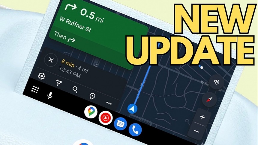
Google Maps keeps evolving on multiple fronts, and after the flood of updates announced by the Mountain View-based parent company on Android devices, the application is also getting a visual facelift on Android Auto.
If you've been keeping an eye on the Google Maps news in the last six months, you probably know that Google has been working on something big, with new evidence spotted online occasionally.
The company never commented on its plans, but small changes, such as a sidebar bringing all options under the same roof, a new floating panel for the speed, and other changes made their way to users, even outside the beta program, regularly.
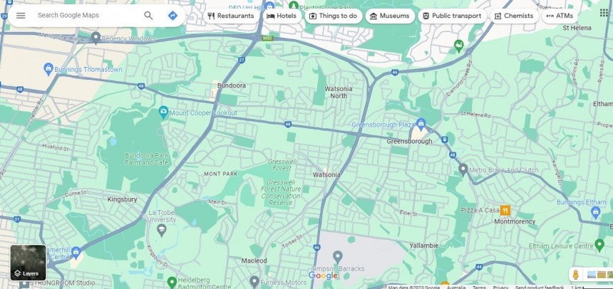
A few months ago, Google started the rollout of a very controversial interface update, adopting a new color scheme that was supposed to make the application feel more modern on all platforms. Many people ended up disappointed with the new UI, calling for Google to bring back the previous color scheme.
The new color choices made it harder for users to distinguish certain elements, such as water from areas with vegetation, including forests. The whole thing was even more difficult on mobile devices, where the limited screen estate turned the different colors into a key part of the Google Maps experience.
However, the Android Auto facelift comes down to a different approach based entirely on a modern interface.
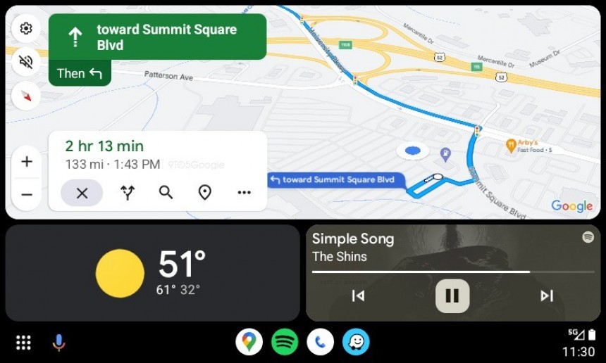
The first thing you'll notice once the new Google Maps interface is updated on Android Auto on your device is the clean approach. Everything looks better organized on the screen, putting the focus on the map and the suggested route. Depending on the screen resolution and aspect ratio, you should see more of the highlighted route, making it easier to follow to arrive at the destination.
The updated UI includes a new sidebar displayed on the side closest to the driver and grouping essential buttons that previously ate up unnecessary screen space. The buttons allowing you to zoom in and out on the map, the compass, the alert muting option, and the settings gear are now pinned to the edge of the screen for quick access. Google Maps has been testing this design for at least two months, and now it's bringing it to everybody.
All buttons use a similar design, and the iconography aligns with the rest of the interface, too. They use a white background, switching to black when the dark mode is enabled.
The rest of the interface is used by the navigation interface.
Google has made the next-turn information panel smaller, so it uses less screen estate, allowing for more map and route details to be available. The "then" panel is also smaller, contributing to Google Maps' increased focus on map information.
The lower side of the interface displays essential trip information, including the ETA to the destination, the remaining distance, and the arrival time. Google has redesigned the panel, too, so it now features a white background with a translucency effect. The essential trip options are displayed with new icons right below, including stopping navigation, looking for alternative routes, searching for a new destination, and previewing the route. The three-dot button in the lower right corner of the panel allows the user to access more information with just one tap.
Overall, Google Maps feels fresh on Android Auto, and I don't know about you, but the clean approach is exactly what I need for navigation. Applications like Waze spam the user with unnecessary information, eventually making the highlighted route more difficult to follow and the interface overall more cluttered.
The cartoonish interface in Waze is horrible, and I'll never understand why the Google-owned company doesn't go for a cleaner approach focused on the navigation experience and the reporting feature. For example, I don't see any reason to display the icons of other Wazers on the map, as the only thing it produces is making the interface more cluttered, reducing the focus on the things that matter the most for drivers.
Google believes the same thing, and the Google Maps visual facelift is a living confirmation that the company knows a clean user interface is integral to a straightforward navigation experience.
The Google Maps update isn't tied to a specific app update, so it's powered by a server-side switch that Google seems to enable gradually. It means not everybody sees the new interface today, as the company needs more time to make sure everything works correctly before reaching the broad availability phase. Meanwhile, you can update to the latest versions of Google Maps and Android Auto to ensure you're up-to-date, but doing this does not guarantee that you'll get the new interface.
Google has also remained tight-lipped on the overhaul, but I expect the company to discuss the new interface in a future post that'll go live on its blog, likely alongside other Google Maps and Android Auto refinements.
The company never commented on its plans, but small changes, such as a sidebar bringing all options under the same roof, a new floating panel for the speed, and other changes made their way to users, even outside the beta program, regularly.
A few months ago, Google started the rollout of a very controversial interface update, adopting a new color scheme that was supposed to make the application feel more modern on all platforms. Many people ended up disappointed with the new UI, calling for Google to bring back the previous color scheme.
The new color choices made it harder for users to distinguish certain elements, such as water from areas with vegetation, including forests. The whole thing was even more difficult on mobile devices, where the limited screen estate turned the different colors into a key part of the Google Maps experience.
However, the Android Auto facelift comes down to a different approach based entirely on a modern interface.
The updated UI includes a new sidebar displayed on the side closest to the driver and grouping essential buttons that previously ate up unnecessary screen space. The buttons allowing you to zoom in and out on the map, the compass, the alert muting option, and the settings gear are now pinned to the edge of the screen for quick access. Google Maps has been testing this design for at least two months, and now it's bringing it to everybody.
All buttons use a similar design, and the iconography aligns with the rest of the interface, too. They use a white background, switching to black when the dark mode is enabled.
The rest of the interface is used by the navigation interface.
Google has made the next-turn information panel smaller, so it uses less screen estate, allowing for more map and route details to be available. The "then" panel is also smaller, contributing to Google Maps' increased focus on map information.
Overall, Google Maps feels fresh on Android Auto, and I don't know about you, but the clean approach is exactly what I need for navigation. Applications like Waze spam the user with unnecessary information, eventually making the highlighted route more difficult to follow and the interface overall more cluttered.
The cartoonish interface in Waze is horrible, and I'll never understand why the Google-owned company doesn't go for a cleaner approach focused on the navigation experience and the reporting feature. For example, I don't see any reason to display the icons of other Wazers on the map, as the only thing it produces is making the interface more cluttered, reducing the focus on the things that matter the most for drivers.
The Google Maps update isn't tied to a specific app update, so it's powered by a server-side switch that Google seems to enable gradually. It means not everybody sees the new interface today, as the company needs more time to make sure everything works correctly before reaching the broad availability phase. Meanwhile, you can update to the latest versions of Google Maps and Android Auto to ensure you're up-to-date, but doing this does not guarantee that you'll get the new interface.
Google has also remained tight-lipped on the overhaul, but I expect the company to discuss the new interface in a future post that'll go live on its blog, likely alongside other Google Maps and Android Auto refinements.


