Just yesterday we were telling you that MINI is going to reinvent itself and focus on different things from now on. The aim is to keep its values intact and keep going with only 5 core models that represent the British company the best way possible.
This wave of changes means that the Roadster, Coupe and Paceman models will be pulled out of production and that one new MINI will be introduced later on, most of the news outlets oscillating between the Rocketman and Superleggera.
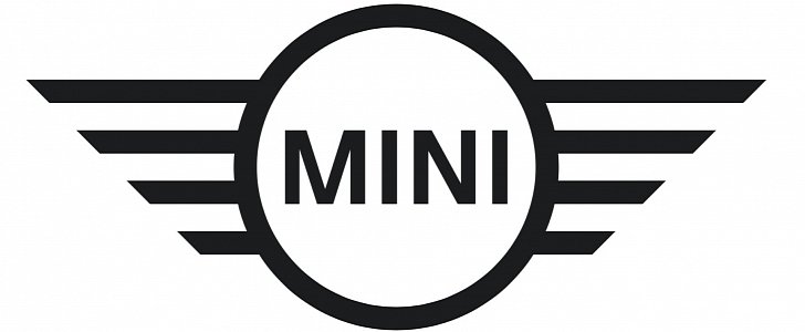
However, there’s another change in plan, one that’s even more serious than all of this: the badge will be changed accordingly too. According to the company, MINI will create a new visual identity for itself and they will start with the logo.
“The original idea behind the MINI design was to develop a highly-efficient vehicle focused on the essentials, but which had the agility to offer a one-of-a-kind driving experience. This combination of clear, emotional design with a focus on the essential will now also define the brand’s new look. A two-dimensional logo, new typography and new tonality underscore the basic idea of clarity and authenticity and will ensure the brand continues to shape the spirit of the times,” the press release says.
And it looks like the new logo is dead on. Compared to the old one, gone are the wings, being replaced by simple, straight lines that symbolize the same thing but in a simpler way, the one thing they are going for.
For me, personally, it looks rather dull and, at this moment, it’s hard to imagine the cars using the new one in the future. However, if any manufacturer is capable of pulling this off, it’s MINI so I’m confident things will work out, especially with the new, concentrated lineup.
