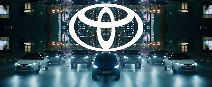
It's been eleven years since Toyota last updated its logo, and even though it's not that long ago, you probably have no recollection of the Japanese brand's old visual identity.
That's because these things rarely produce any radical changes, focusing more on updating the logo to the visual standards of the era. Toyota's new logo (to be used in Europe for now) makes no exception, though this year's refreshing does bring one very important novelty.
You might be looking at the new logo and wondering "OK, what's new about it?" It's totally understandable since the overall shape of the logo is identical. What's different is that, much like Volkswagen did before it, the new one loses the 3D aspect brought by the old one's shading for a much simpler look.
The real shocker here isn't what you see, though, but what you can't see. In a very bold move that not that many brands made throughout time - and certainly not in the automotive industry - Toyota is dropping the wordmark altogether just like Nike or Apple did before it. That means the stylized "T" (made out of three overlapping ellipses) we've become so accustomed to will soon be the sole bearer of the company's identity.
It can be argued that almost any major carmaker could do the same and not suffer one bit for it. Think of any brand you want, and its logo will instantly pop into your mind without any hesitation or risk of confusion. Audi, BMW, Chevrolet, Ford (that's a cheat since the actual name is an integral part of the logo), Mercedes-Benz, Mazda, Volkswagen, even Tesla - they could all follow Toyota's lead - and might actually do so soon.
The new 2D style falls in line with the current trend aimed at making the logos more accessible for their wide-spread digital use. These symbols are no longer restricted to a car's bonnet and the brochures you pick up at the dealership, so simplification was mandatory. Volkswagen did it, BMW did it, Nissan did it, and others will undoubtedly follow.
The interesting question now is "where do we go from here?" At this point, with our 2020 brains, we don't see how Toyota's logo could get simplified even further. That means any changes in the future would have to follow a different path. We have no idea what that path may be, but we're kind of curious to find out.


