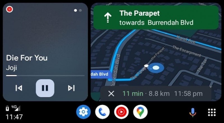
The rollout of Android Auto Coolwalk started two months ago, but as more users receive the new design, it’s becoming clearer there’s still room for improvement.
The Android Auto redesign is centered around the split-screen interface.
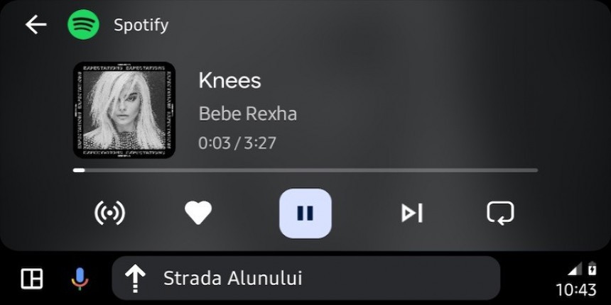
Thanks to so-called cards, users are allowed to have more than a single app on the screen at a certain time. Until now, all apps were running in full screen. Coolwalk uses cards to let them run side-by-side, offering support for navigation apps, audio players, phone calls, weather information, and others.
Compared to the CarPlay Dashboard, which also uses cards for a similar approach, Coolwalk is more dynamic. Google can sometimes show suggestions, and users are also provided with options to choose what card they want closest to the driver.
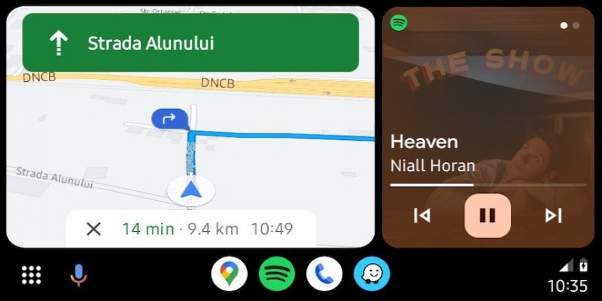
On portrait head units, the secondary card goes to audio apps, such as Spotify, YouTube Music, and others. All audio apps come with the same design in the Coolwalk card, as they must use the template that Google has integrated into the new design.
As such, they display the app icon in the top right corner, the name of the song and the artist, the progress bar, as well as the playback controls. Needless to say, the buttons to play/pause the song, and skip to the previous or next song are large, as they must be used with touch input by drivers.
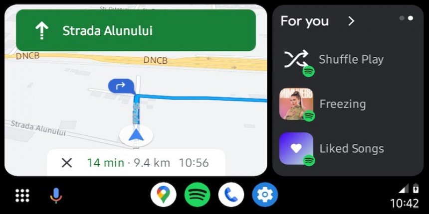
A swipe left on the audio card reveals additional options, such as playing a specific playlist or shuffling favorite songs.
First and foremost, their purpose is to improve the interface from a styling perspective. At some level, they make the interface more colorful and given such colored overlays typically offer a sense of fresh design, it’s easy to see why Google wanted them to be part of Coolwalk.
Second of all, the colored overlays make the information at the bottom of the screen easier to read. Given the album artwork behind the colored overlay is no longer clear, the name of the artist, the song, and the playback controls are easier to interact with.
These colored overlays seem to be the feature people hate the most. This happens for two reasons.
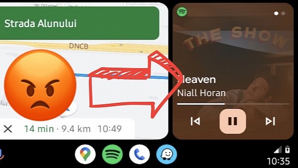
The overlays cover the album artwork so much that it can barely be observed. This was one of the first things I noticed after I tried out Coolwalk for the first time in my car. Looking at the album cover while in motion is a big pain in the neck, especially if you drive on a sunny day.
The album art can hardly be spotted behind the colored overlay, and if the sunlight is directed right at your head unit, figuring out what’s in there is impossible. There’s no way to adjust the transparency level of the overlay, and more often than not, they only make sense at night.
The album art is only fully visible in the center, while the edges are entirely covered by the colored overlays. This makes sense at the bottom of the card, where the focus is on the displayed information, but it doesn’t in the rest of the UI.
The second reason why almost nobody likes this feature is the weird choice of colors. The color selection sometimes makes no sense at all, and it seems random, at best.
I noticed that the colored overlays are most often blue, but in some cases, they turn gray, making the album artwork even more difficult to see. Some users say the grayish overlay covered the entire album artwork, eventually turning the audio card into a big gray block.
The feature doesn’t seem to check out the album artwork colors and adjust its settings accordingly. The selection appears to use a random algorithm whose purpose is only to make the audio card feel fresh and modern.
For the time being, Google isn’t offering any options to configure the audio card on Coolwalk. No matter if you like the colored overlays or not, you must use them, at least until the company comes up with a way to improve them.
Sure enough, no information on such plans has been shared. The rollout of Coolwalk is still underway, as the search giant uses a phased approach for the process. The new interface is enabled with a server-controlled model, so Coolwalk isn’t tied to a specific app update.
The company did not provide a specific ETA for the broad availability, but the rollout should be completed this year. At this point, enrolling in the beta program seems to be the fastest way to get Coolwalk on an Android device.
Thanks to so-called cards, users are allowed to have more than a single app on the screen at a certain time. Until now, all apps were running in full screen. Coolwalk uses cards to let them run side-by-side, offering support for navigation apps, audio players, phone calls, weather information, and others.
Compared to the CarPlay Dashboard, which also uses cards for a similar approach, Coolwalk is more dynamic. Google can sometimes show suggestions, and users are also provided with options to choose what card they want closest to the driver.
How Coolwalk handles music cards
The navigation app, be it Google Maps or Waze (in beta for now), receive the largest card on the screen. This approach makes perfect sense, as they typically display the most information, therefore requiring more screen estate.On portrait head units, the secondary card goes to audio apps, such as Spotify, YouTube Music, and others. All audio apps come with the same design in the Coolwalk card, as they must use the template that Google has integrated into the new design.
As such, they display the app icon in the top right corner, the name of the song and the artist, the progress bar, as well as the playback controls. Needless to say, the buttons to play/pause the song, and skip to the previous or next song are large, as they must be used with touch input by drivers.
A swipe left on the audio card reveals additional options, such as playing a specific playlist or shuffling favorite songs.
Coolwalk’s problem with music cards
Google has designed colored overlays for the audio cards on Coolwalk with two goals in mind.First and foremost, their purpose is to improve the interface from a styling perspective. At some level, they make the interface more colorful and given such colored overlays typically offer a sense of fresh design, it’s easy to see why Google wanted them to be part of Coolwalk.
Second of all, the colored overlays make the information at the bottom of the screen easier to read. Given the album artwork behind the colored overlay is no longer clear, the name of the artist, the song, and the playback controls are easier to interact with.
The overlays cover the album artwork so much that it can barely be observed. This was one of the first things I noticed after I tried out Coolwalk for the first time in my car. Looking at the album cover while in motion is a big pain in the neck, especially if you drive on a sunny day.
The album art can hardly be spotted behind the colored overlay, and if the sunlight is directed right at your head unit, figuring out what’s in there is impossible. There’s no way to adjust the transparency level of the overlay, and more often than not, they only make sense at night.
The album art is only fully visible in the center, while the edges are entirely covered by the colored overlays. This makes sense at the bottom of the card, where the focus is on the displayed information, but it doesn’t in the rest of the UI.
The second reason why almost nobody likes this feature is the weird choice of colors. The color selection sometimes makes no sense at all, and it seems random, at best.
I noticed that the colored overlays are most often blue, but in some cases, they turn gray, making the album artwork even more difficult to see. Some users say the grayish overlay covered the entire album artwork, eventually turning the audio card into a big gray block.
For the time being, Google isn’t offering any options to configure the audio card on Coolwalk. No matter if you like the colored overlays or not, you must use them, at least until the company comes up with a way to improve them.
Sure enough, no information on such plans has been shared. The rollout of Coolwalk is still underway, as the search giant uses a phased approach for the process. The new interface is enabled with a server-controlled model, so Coolwalk isn’t tied to a specific app update.
The company did not provide a specific ETA for the broad availability, but the rollout should be completed this year. At this point, enrolling in the beta program seems to be the fastest way to get Coolwalk on an Android device.
