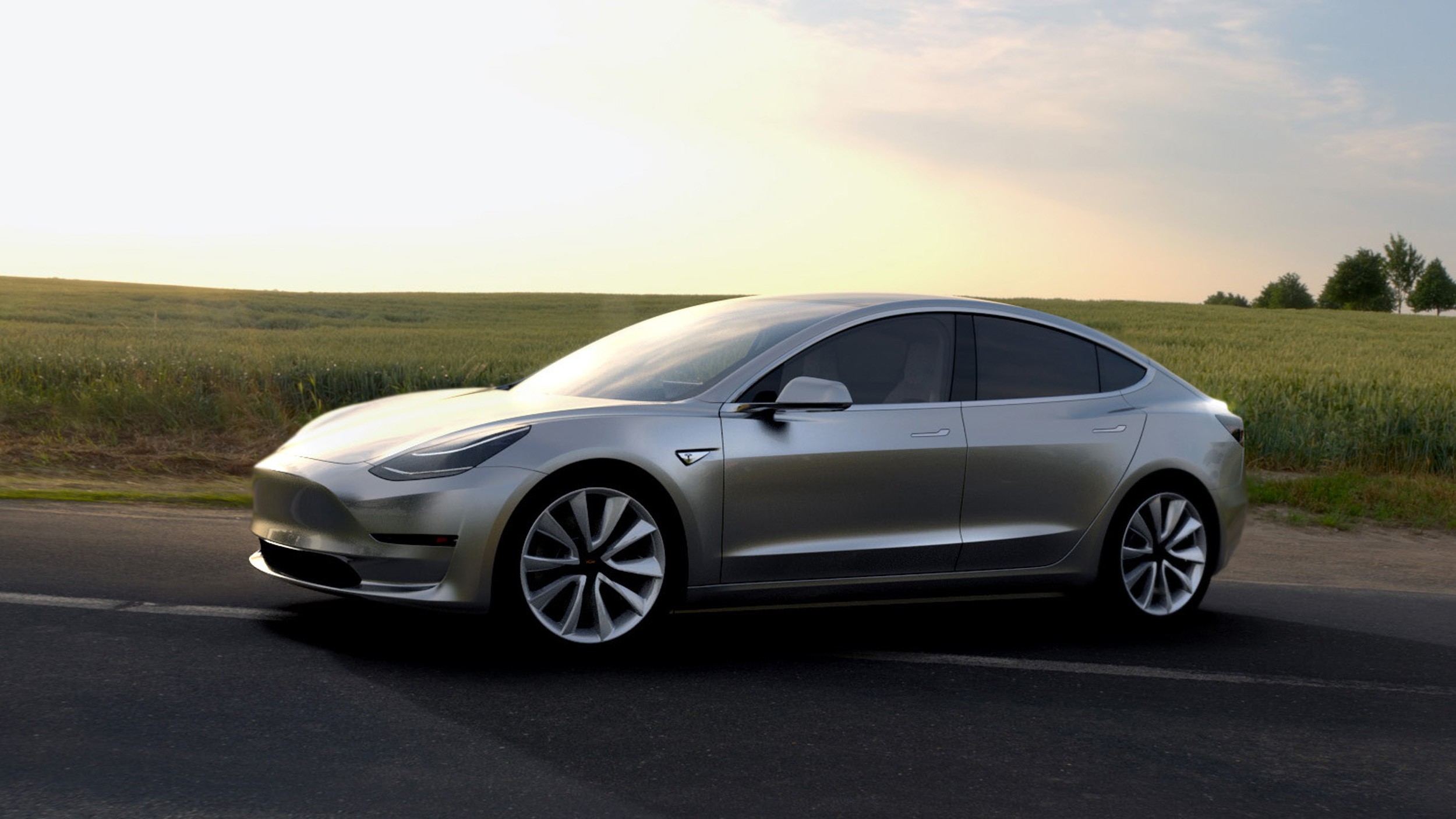
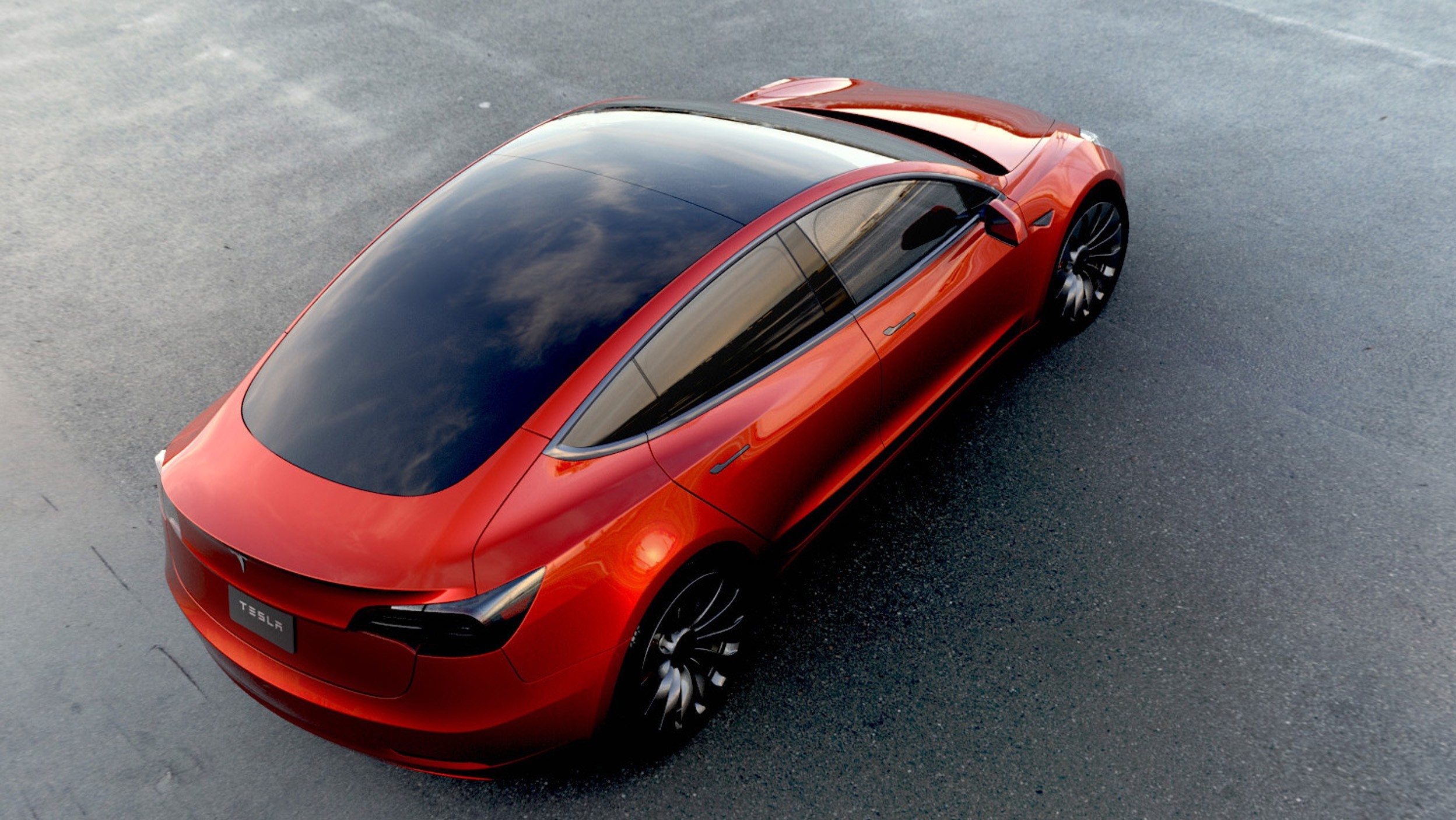
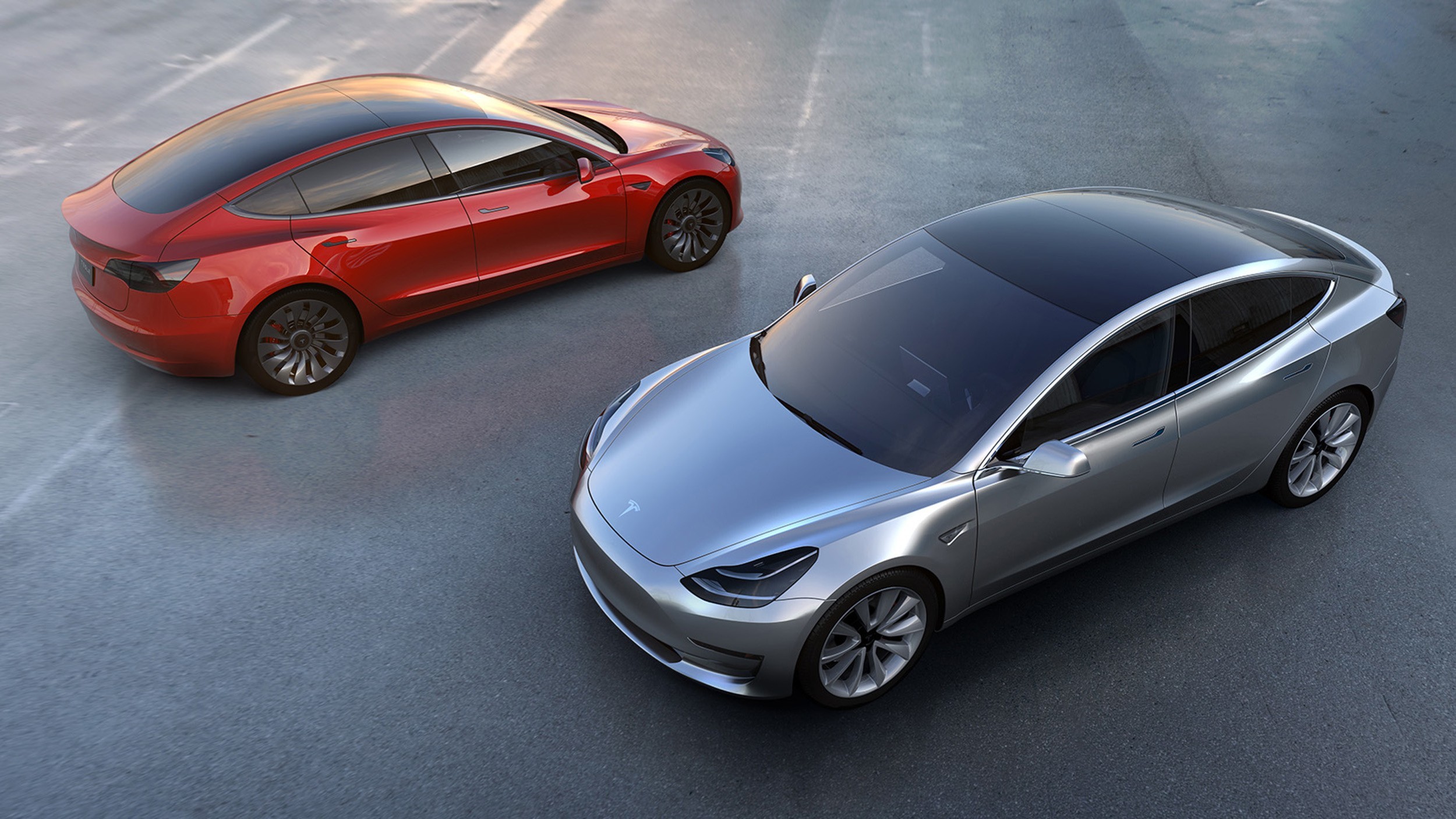
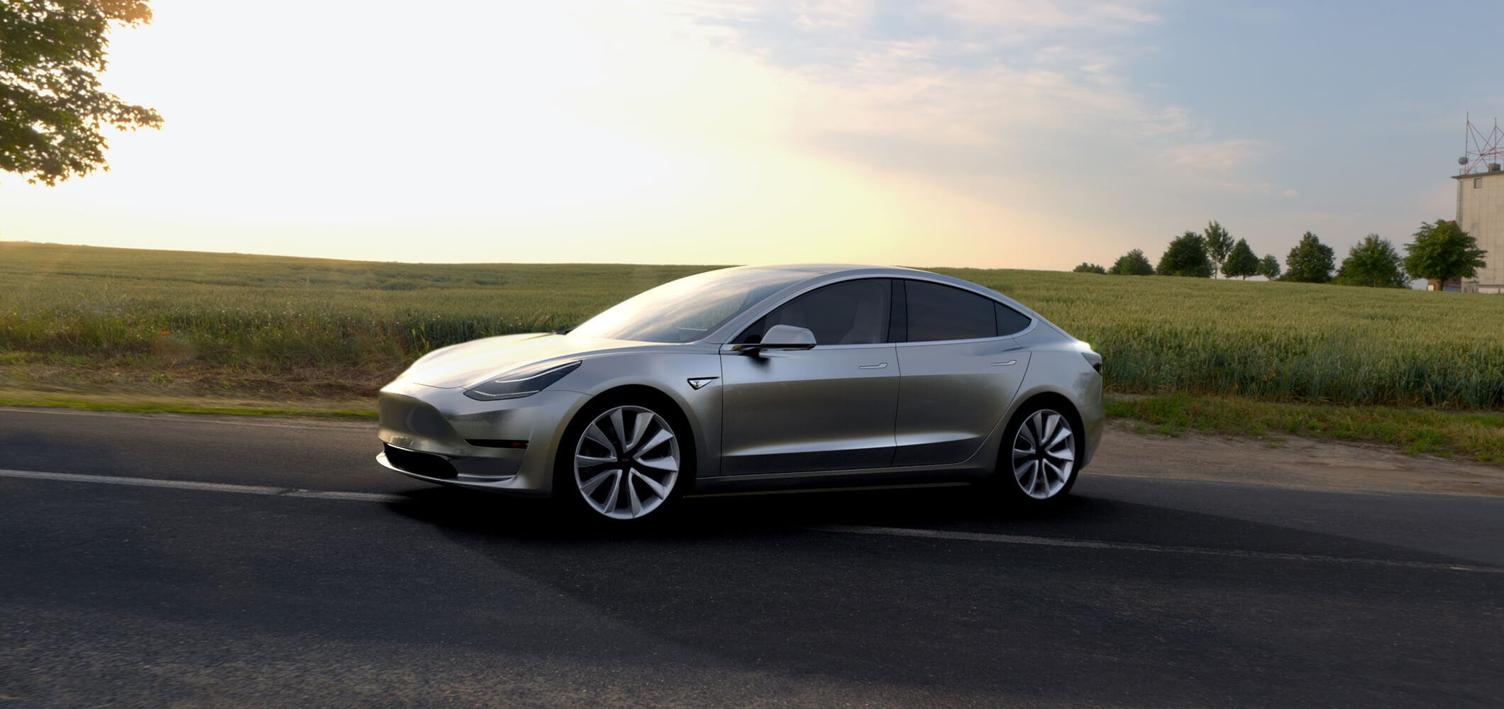
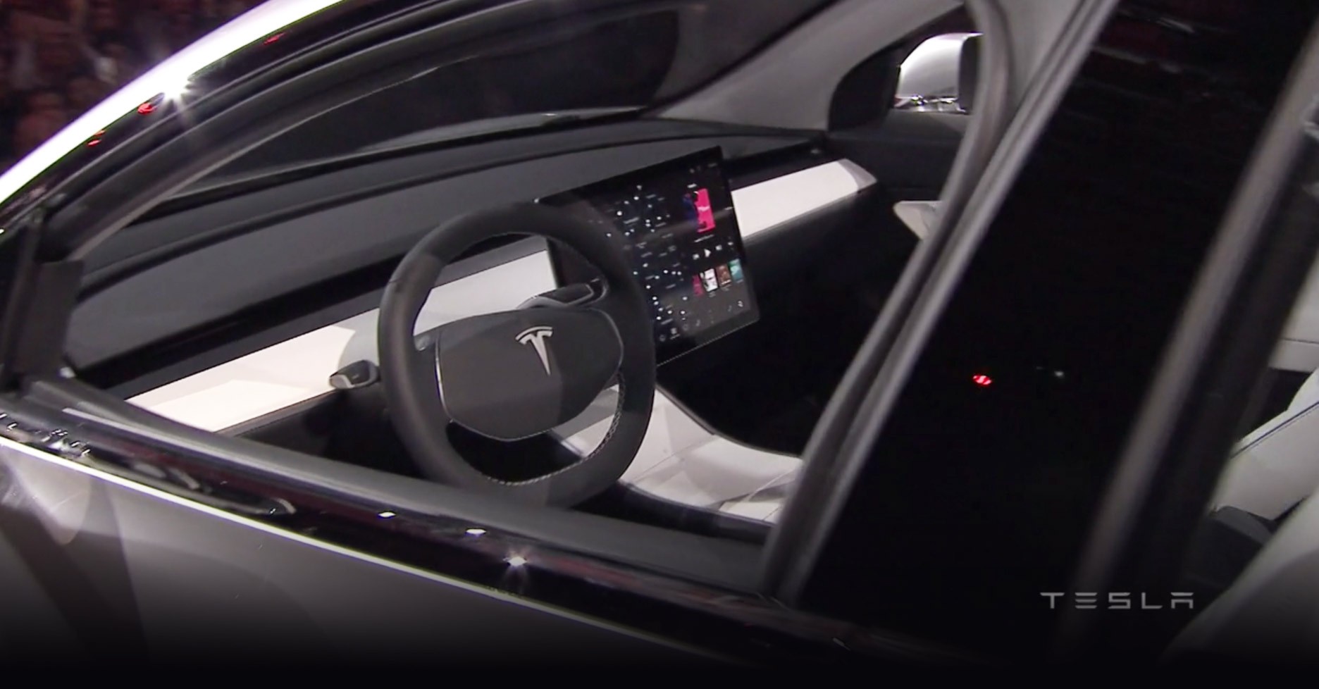
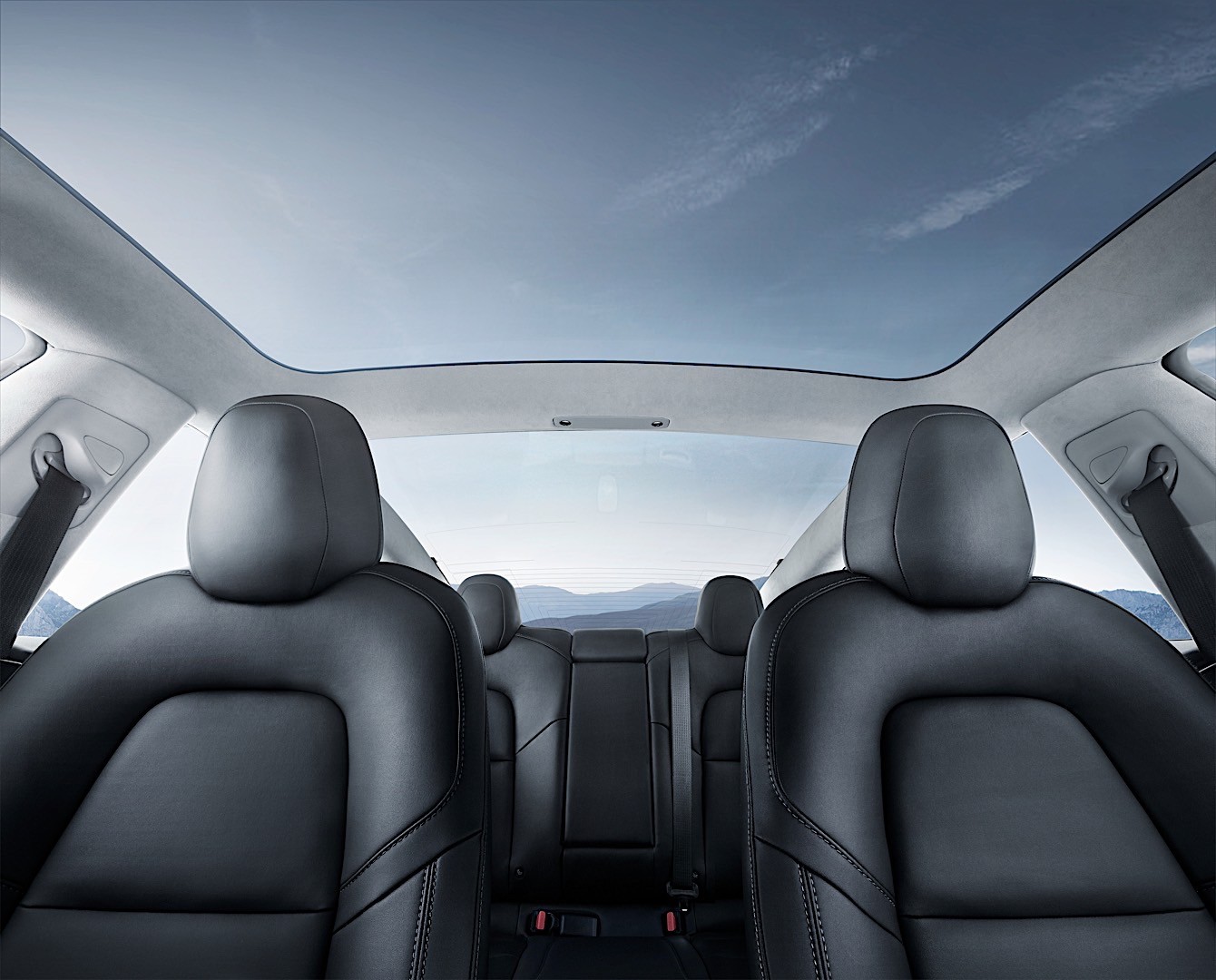
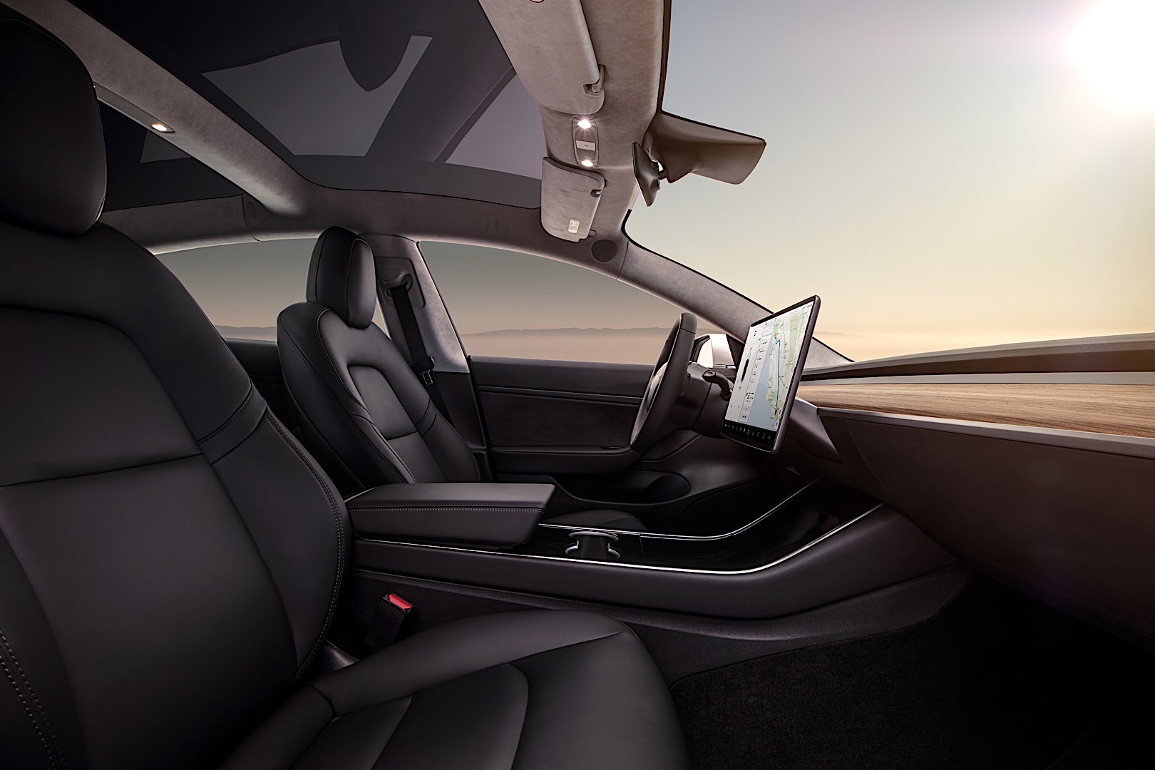
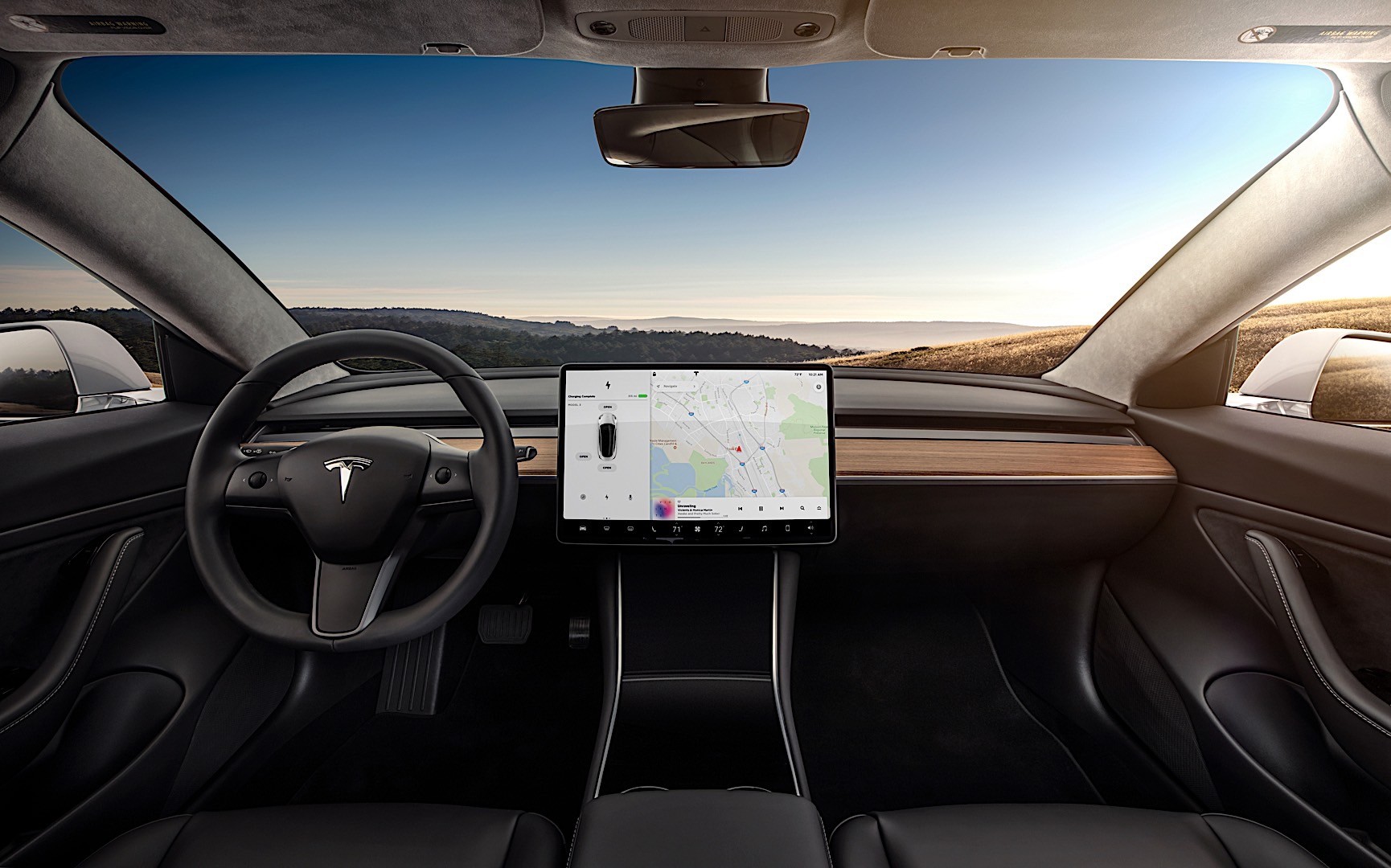
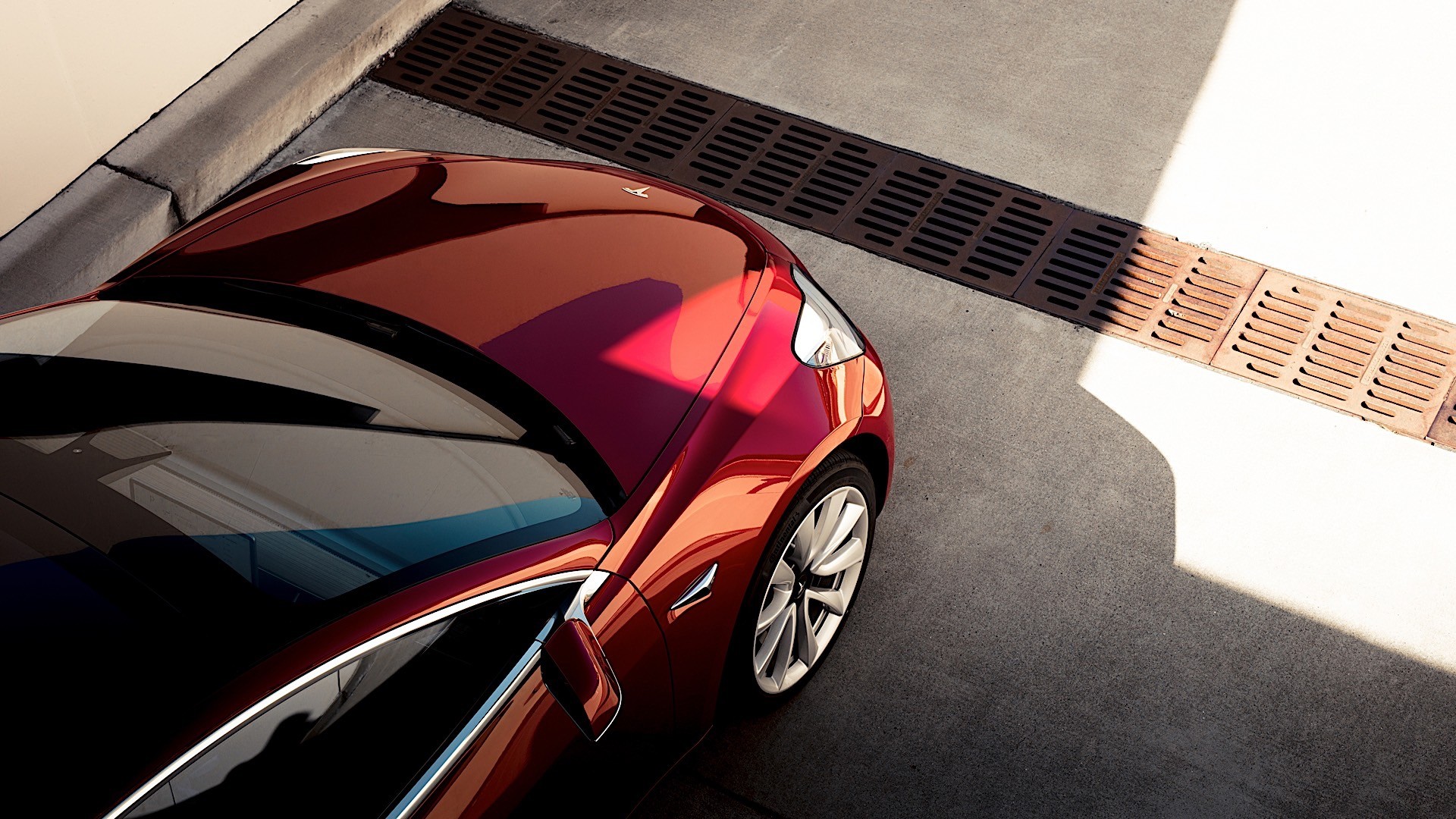
Even before the Model 3 was launched with its single central display providing the only area of interaction with the vehicle, the Models S and X before it had zero actual physical buttons on the dashboard.
Most people saw that as a characteristic of the brand, but even some of those who supported it felt a bit consternated in front of Model 3's sparse interior. The smaller sedan ditched the instrument cluster as well, leaving the now horizontally positioned display to show all the information needed.
After a long debate over whether a head-up display would have been useful or not, most Model 3 owners swear the system works just fine and they don't feel the need for any other means of communicating with the car. Yet stick somebody who hasn't driven a Tesla before in a 3 or a Y and watch them as they go way over the speed limit thanks to a combination of the powertrain and the absence of a speedometer in front of their eyes.
The classic thinking says that physical buttons make more sense inside a vehicle because of two reasons: they don't change places and they are easier to identify by touch alone, allowing the driver to keep their eyes on the road. Numerous ergonomics studies have shown this to be true, which is why companies such as BMW and Mazda insist on offering a way of controlling their infotainment systems without the need to touch the screen.
Edmunds expert Mark Takahashi seems to agree as he's included the replacement of physical buttons with touchscreens in his list of car design trends that need to stop, with the Model 3 the obvious prime culprit. He admits the clean dashboard left behind looks good but thinks there is still some purpose behind a button or a dial that you can actually push or grab.
Tesla, on the other hand, argues that a completely digital interface allows it to implement further updates a lot easier, and it's hard to argue with that. If the company so wanted, it could change the entire layout of its system for all users literally overnight. You can't do that with physical buttons. Plus, this oversized smartphone solution starts to make a lot more sense if you imagine it inside an autonomous car, something Tesla is aiming toward.
As always, the truth lies somewhere in the middle. Tesla's point about making upgrades easier is solid, but it doesn't change the fact that at least climate controls - and maybe a volume dial - should retain their physical form for the time being. Apart from that, whether you use a rotary button or your fingers on a screen, you're still going to take your eyes off the road for any sat-nav input which makes any debate between the two pointless.
"Boy meets car, boy loves car, boy gets journalism degree and starts job writing and editing at a car magazine" - 5/5. (Vlad Mitrache if he was a movie) Full profile
Would you like AUTOEVOLUTION to send you notifications?