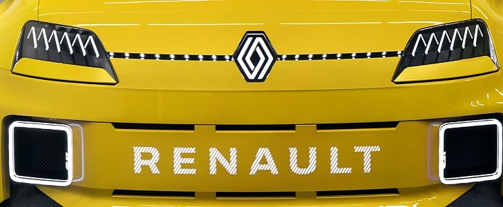
Peugeot and Renault might soon start a chicken and egg conundrum with the recent reinvention of their corporate logos. Besides asking which of the rivals came up with the idea first, there’s another potential issue coming up when comparing Renault's design against other representatives of the industry.
In late February, Stellantis’ upmarket brand Peugeot decided these times of comprehensive transformations warranted a major corporate change. Thus, the French company presented to the world (both for the automotive and motorcycle divisions, so we don’t get confused) its bold new visual identity in the form of an updated logo.
The traditional lion association has been retained, but the new look eschews the humanoid-like bipedal depiction we’ve grown used to seeing over the past ten years with something that may even be called a mug shot. Of course, that’s not what Peugeot wants to allude to, going for the more elegant “coat of arms adorned with a magnificent lion's head” approach instead.
Of course, this eleventh version can be interpreted by anyone according to their heart’s desire. So, let’s refocus on their rivals from Groupe Renault, which, coincidence or not, have moved towards their own corporate identity realignment in some markets. As such, the latest advertising campaign for the popular Renault Zoe fully electric hatchback has revealed an equally new logo.
Actually, it’s not that new because we’ve already seen it mid-January on the tasty Renault 5 EV prototype. Back then, the French carmaker was more preoccupied with explaining what it has planned for the near future across its various brands, so it didn’t make a big fuss about its retro-styled logo.
We like both the new Peugeot and Renault logos, but there’s a potential issue as far as Renault's new logo is concerned. In my humble opinion, there’s one other industry representative that has a rather similar logo to Renault's refreshed rhombus.
That would be Rivian, which makes use of the same general shape as Renault. With the recent update from the French carmaker, their logos are even more susceptible to confusion since both companies use intertwined lines for their most important element of brand identity. Of course, if it ever comes down to a dispute between them, the electric startup will most likely need to change its logo because Renault first used the rhombus in 1925.


