Even if humanity had bigger fish to fry this past year, our most urgent matter in the long run remains. Pollution, and all the effects that come with it, has a greater potential to change our lives than the ending health crisis did.
Last year, for a few short months, as the world ground to a halt, scientists have been able to measure drops in pollution levels, and here and there, a gradual return of air quality to normal values. But now we’re back at it, and the effects are rapidly piling up.
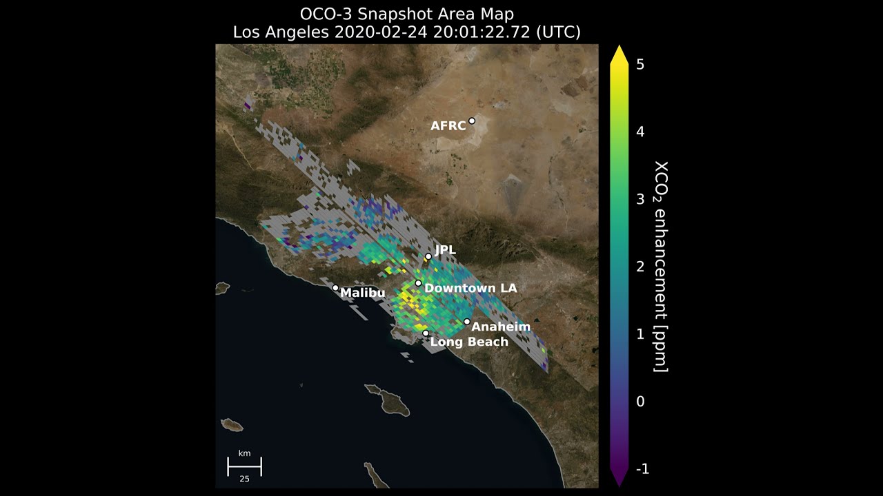
This week, NASA released something it calls one “of the most accurate maps ever made from space of the human influence on carbon dioxide (CO2) in the Los Angeles metropolitan area.” It showsthe effects of human activity on an area of about 50 square miles (80 square km) of the city.
For the record, the data refers to a pre-lockdown period, with the measurements made in October 2019 and February 2020. The results were just published in the June issue of the Remote Sensing of Environment journal.
What you’re looking at in the video below is a color-coded map created with the help of the Orbiting Carbon Observatory 3 (OCO-3) attached to the International Space Station. It is supposed to show “tiny variations in airborne CO2 from one mile of the giant L.A. Basin to the next,” with each pixel representing 1.3 miles (2.2 km) of Los Angeles real estate.
To translate a bit what you see there, the brown patches of land to the north and east of the city represent clean desert air, while the colors indicate how much higher the concentration of CO2 is in that spot compared to the desert.
Green and blue mean things are not that bad, but yellow means CO2 levels are five parts per million higher than in the clean areas, which according to NASA, is “equivalent to the amount that global atmospheric CO2 is rising globally on average every two years.”
As visible from the map, most of the yellow is focused on the west side of the city, a reality attributed by NASA to the fact that there are more congested freeways and industries that emit CO2 there.
The space agency hopes this map and the research that comes with it will help decision-makers better understand how and where to act. It also gives us average Joes a better understanding of the fact that yes, our actions do have an impact, and maybe we should act differently.
Daniel loves writing (or so he claims), and he uses this skill to offer readers a "behind the scenes" look at the automotive industry. He also enjoys talking about space exploration and robots, because in his view the only way forward for humanity is away from this planet, in metal bodies. Full profile
Would you like AUTOEVOLUTION to send you notifications?