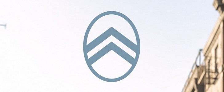
Citroën has announced it will change its logo, along with its corporate brand identity, starting in mid-2023. The French marque has revealed its new logo, which is its tenth in its history and is a reinterpretation of the first badge, from 103 years ago. The first Citroën model to feature the new logo will be exhibited at the end of September.
The new one closes the loop by returning to the logo from 1919, which is not something that many brands out there can do. Citroën has a rich history behind it, with several world-firsts in their day, and it would have been a shame to leave a simple, but effective logo behind.
The original emblem of the Citroën brand was adopted by its founder, André Citroën, who was already a successful entrepreneur with his metalworking company that made chevron-shaped “herringbone” gear systems. The latter were responsible for André Citroën's success due to their superiority over conventional gears, and the French founder had to integrate them into his new business idea.
In a way, Citroën was quite conservative with its logo changes over the years, as it took the company 103 years to reach its tenth redesign, which is not something that other brands could say.
For example, the Corvette logo changed with every generation of the American sports car, so those who think that Citroën is going too fast with its logo changes need to take a closer look around.
With the new badge, Citroën is also embracing a new brand identity, which includes a new brand signature: “Nothing Moves Us Like Citroën.” The latter will start to be used in both corporate and product communications in the future, so expect to read that in an e-mail signature when you are expecting a message from your local Citroën dealership.
Naturally, on top of the new logo, all the visual identities related to it will be changed, and the design team even developed a “dark mode” for it, which will be shown on digital screens whenever that mode is applied.
The French automaker has also implemented new fonts to match the new logo, as well as adapted merchandising, corporate building signage, and even the documentation sent to dealerships.
Also with the new logo announcement, Citroën has noted the return of Monte Carlo Blue in its lineup, as well as the replacement of the current shade of red with a new shade, called Infra-Red (that's their pun, not ours).


