As we all know, every single car company out there has its very unique history, mostly related to the way it managed to emerge from a tiny entity into a huge conglomerate that sells hundreds of thousands or maybe millions of vehicles a year. And some of these stories are indeed fascinating and captivating and each of us is invited to find them out once the dealers hands us the keys.
Basically, the cars' logos are the introduction to the companies' tales, most of them showing symbols or signs that remind us of the thrilling experiences the automaker had to go through to stay alive. Today, we're inviting you to a journey through some of the most important car logos, so keep reading to find the tales hidden behind the emblems we see every time we get behind the wheel.
ABARTH
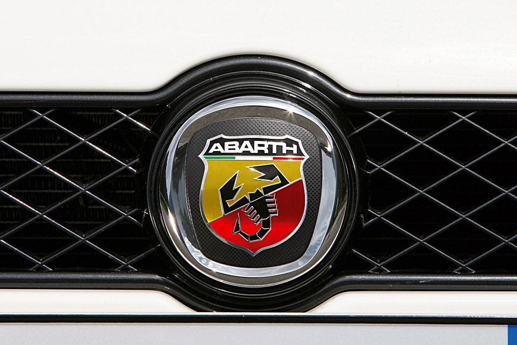
The three colors underneath the company's name, green, white and red, symbolize Italy's flag, as the company was brought to life in Turin. The scorpion is Karl Abarth's astrological sign – he was born on November 15, 1908 – and is complemented by the two dominating colors, yellow and red, which are indicating the brand's appeal for motor racing.
ALFA ROMEO
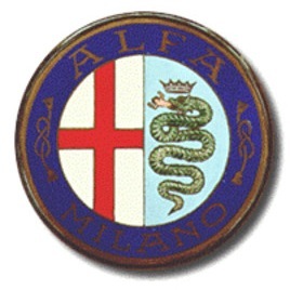
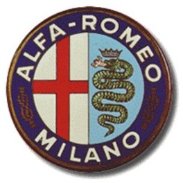
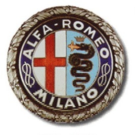
Alfa Romeo, also owned by Fiat but still considered an Italian symbol, is one of the companies whose logo changed a lot over time, but retained the main elements that remind us of the way the brand was brought to life. Alfa Romeo, initially known as Anonima Lombarda Fabbrica Automobili (Lombard Automobile Factory, Public Company), got its first logo in 1910, when Romano Cattaneo created a rounded badge consisting of a grass snake with a man in its jaw. Inspired from the House of Visconti flag, the so-called "biscione" (the Italian term for grass snake) actually represents one's ability to stand against opponents and face competition.Additionally, Cattaneo added the red cross seen in the Milan flag, plus the Alfa Romeo designation separated by two Savoia dynasty knots. Over time, the knots were eliminated from the logo, with each symbol comprising the logo receiving minor "redesigns".
AUDI
The "brand with the four rings" as Audi is often called is currently one of the world's top automakers and surely a leading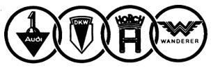
First of all, the emblem is seen as a symbol of the merger that took place in 1932 and included four large manufacturers of that time: Audi, DKW, Horch and Wanderer.
On the other hand, some people believe that Audi's logo is a bit older and has a strong connection with the Olympic games.
Either of the two meanings are actually true, the Audi logo underwent a minor makeover in 2009 when the badge got a new font plus a restyled 3D design of the four rings.
BMW
Bayerische Motoren Werke or Bavarian Motor Company – BMW as most of us know the brand – is, once again, one of the largest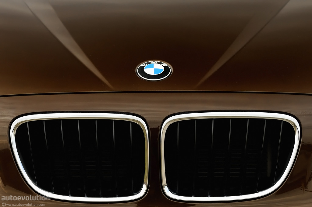
The company's logo is obviously based on these facts, but there are again multiple interpretations available.
One of them claims that the blue and white colors, which are actually the traditional colors of Bavaria, BMW's natal region, are also representing a white propeller on a blue sky, a hint to BMW's aero history.
On the other hand, some people believe that the two colors are only used because they also appear on the Bavarian flag and BMW just wanted to honor the area that hosted its headquarters for years.
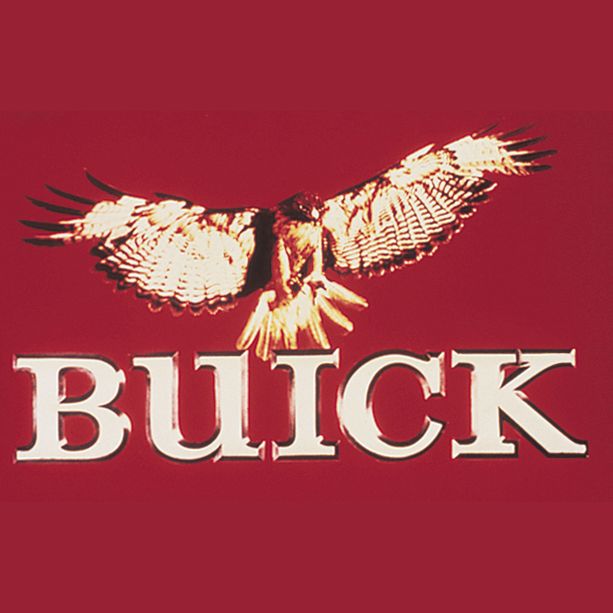
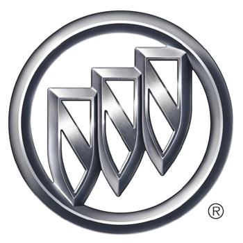
BUICK
Buick, an American symbol as some people name it, was founded in 1903 by David Dunbar Buick. Its history, often connected to General Motors, includes several logo changes that occurred as the company grew bigger. The first logos were actually variations of the Buick designation, but were replaced during the '60s by three shields representing the three models rolled out until that point: LeSabre, Invicta, and Electra.1975 brought a new change of logo at Buick, with the American icon now adopting a hawk emblem, known at that time as "Happy", that was expected to mark the beginning of a new design era in Buick's history. The moment was celebrated with the introduction of the Skyhawk series. However, the range was discontinued during the '80s, when Buick re-adopted its three-shield badge.
CADILLAC
Both the name and the logo used by Cadillac were based on the aristocrat the company was named after, Antoine de La Mothe, Seigneur de Cadillac, but the badge suffered several modifications, especially under GM's ownership. The auto manufacturing business received the Cadillac designation in 1902 but during the '90s General Motors brought a few changes as part of an effort to refresh the company's image. The logo thus dropped the six birds (codenamed merlettes), as well as the crown and the La Mothe family crest, but adopted simpler elements that are still being used nowadays.CITROEN
There's nothing fancy or too complicated in Citroen's logo which remained practically unchanged over the time. The two inverted Vs are actually reminding of André Citroen's first area of expertise: mass production of double helically-cut gear teeth.CHEVROLET
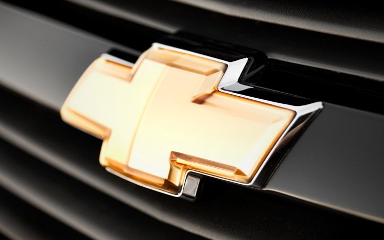
In case you're wondering where does the Chevrolet "plus" symbol comes from, there are several suppositions behind it. First of all, some people are saying that William C. Durant actually designed the logo after a wallpaper he saw in a French hotel. On the other hand, others are claiming that this badge was first seen in a newspaper and Durant's wife proposed it to be used as Chevrolet's logo.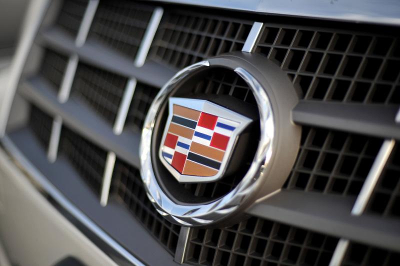
FERRARI
Almost every car enthusiast out there knows the "Prancing Horse", especially thanks to the great achievements the Italian carmaker recorded in the past. But the story of its logo is once again related to multiple theories. First of all, it is believed that the black prancing horse on yellow background was first used by Count Francesco Baracca, the Italian airforce that made a name for itself in World War I. Another theory claims the symbol was actually seen on a German pilot's plane that crashed during the war - the horse is actually the symbol of Stuttgart, which might raise some eyebrows because Porsche uses the same element as source of inspiration for its very own badge.Last but not least, the Ferrari logo might have a different story. It appears that Ferrari founder's family owned lots of horses so the new company adopted the prancing horse as a symbol of power. However, one thing is 100 percent sure: the three colors appearing on Ferrari's logo represent Italy's flag, the company's natal country.
FIAT
Fiat, currently the largest Italian automaker and one of the new names in the American auto sector, changed its logo several times, especially following the growth the company recorded during the 1900s. The first emblem created by Fiat's designers was only showcasing the company's full name: Fabbrica Italiana Automobili Torino (Italian Automobile Factory of Turin). As the time passed by however, Fiat modified the logo several times, with the latest change getting into effect in 2006 when the company turned to the red background instead of the blue one.FORD
Ford is surely one of the most powerful automakers in the whole world and the fact that it managed to survive the 2009 crisis without government help comes to confirm this. And the origins of its logo are at least as interesting as the company's past: Harold Wills, often considered Henry Ford's main help within the company, had his very own business card printing company before working for Ford. When Henry Ford decided to choose a badge for the company, Wills designed the first sketch of the logo using his printing equipment and a font he used on business cards.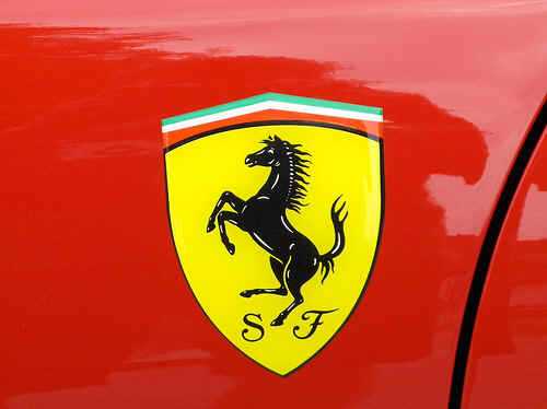
HYUNDAI
The Hyundai logo is just a regular badge at the first sight. However, there are multiple meanings of the "H" letter you're seeing on every Hyundai out there.First of all, the oval that surrounds the H letter is actually representing Hyundai's continuous expansion that now goes beyond the Asian continent. And the H is indeed coming from Hyundai but, in addition, it also represents two people shaking hands, probably in an attempt to show Hyundai's appreciation for consumers buying its models.
JAGUAR
The meaning of the Jaguar logo is quite simple and one could understand it in a second, especially after driving a Jag. Just as we learned in our first school years, the Jaguar is a quick and agile feline, so placing such a badge on a car is actually an effort to underline its vehicles' ability to develop very high performance.KIA
The South-Korean brand Kia owns quite a simplistic logo that does nothing than to show the company's name on a (usually) red background. However, if you split the word into two separate parts, the term Kia also has a different meaning. In Korean, KI (the first two letters of the name) stands for "arise" while the A is believed to represent Asia, Kia's natal continent. In this context, the name translates into "arise from Asia", hence matching the company's slogan "The power to surprise".

LAMBORGHINI
The logo seen on all the Lambos out there (burning or not) isn't surprising at all. The bull logo actually stands for the founder's, Ferruccio Lamborghini, zodiacal sign (Taurus), and is obviously accompanied by the company's name, Lamborghini. Contrary to other "patriot" Italian carmakers, Lamborghini does not use the Italy's colors on its logo.MAZDA
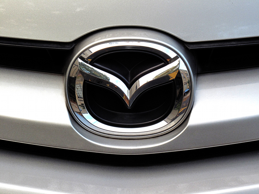
Based in Hiroshima, Japan, Mazda is becoming more powerful in most markets, especially in Europe where its models are getting more powerful thanks to the company's efforts in the fuel consumption and emission areas. Its logo, which suffered several modifications as time passed by, has multiple interpretations. The company's name, which is inspired by the ancient Iranian prophet Zoroaster, seems to serve as source of inspiration for the badge as well: the restyled "M" (which looks like two spanned wings) is believed to represent the company's flight to the future.MERCEDES-BENZ
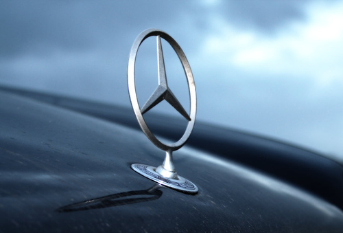
Mercedes-Benz, an iconic premium and luxury, has been around for a long time but the brand "Mercedes" was only registered in September 1902. The three-pointed start logo however saw daylight in 1909 on a Daimler vehicle and represented the company's domination of land, sea and air. Just as expected, the badge got several "facelifts" as the company grew bigger, but the first interpretation is believed to date back to early 1900 when Gottlieb Daimler drew a star on a picture, adding the following text: "this star would one day shine over own factory to symbolize prosperity."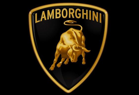
MITSUBISHI
The Japanese carmaker Mitsubishi is the subject of several theories when it comes to its logo and although several people are talking about them, there's no official information supposed to put things straight in this matter. According to some sources, the Mitsubishi designation is actually a combination of the words "mitsu" (three) and "hishi" (water chestnut, which could be translated into "diamond"). In other words, the term Mitsubishi could mean "three diamonds", hence the logo of the company.However, there are two interpretations of the logo. Some people consider that the three-diamond logo stands for a mix of the Iwasaki family (who established the business) crest, three stacked diamonds, and the three-leaf crest of the Tosa Clan. On the other hand, the three diamonds could represent the three main attributes describing the company: responsibility, ethics and communication. Last but not least, the logo could actually represent a ship propeller, reminding us of the beginning of the Mitsubishi business.
PORSCHE
As we said when talking about Ferrari, Porsche uses as a logo Stuttgart's symbol, which is also accompanied by the antlers and red and black stripes that are all parts of the arms of the Kingdom of Wurttemberg.PEUGEOT
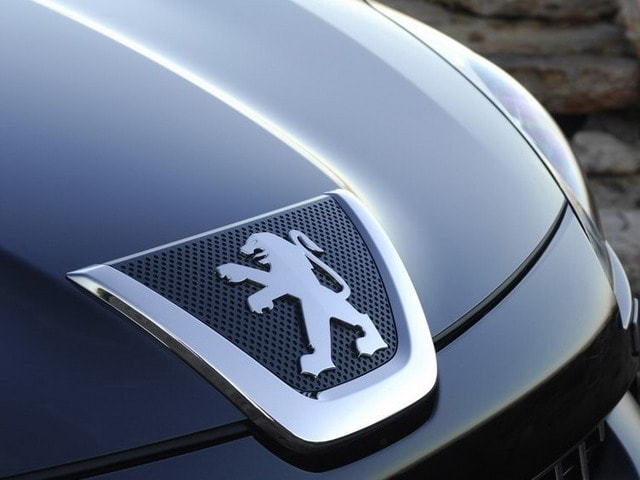
From the point of view of its logo, Peugeot surely has one of the most captivating stories. The French lion was officially created in 1847 by Justin Blazer who worked as jeweler and engraver and was based on the Region France-Comte flag. However, the logo appeared on Peugeot cars only years later, receiving a lot of modifications over the years. The last modifications occurred in 1998 and 2002 when the company reworked the look of the lion in an effort to better underline the "message" of the logo: it denotes power and balance, while the blue is believed to represent the company's view of the future.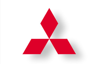
RENAULT
Renault, now involved in one of the world's biggest alliances with Nissan, changed its logos for over 10 times since it was founded. The French carmaker used an entirely different badge, showing the initials of the three Renault brothers (Louis, Ferdinand and Marcek) drawn on a medallion. The diamond badge was only adopted in 1925, while the 3D perspective was added in 1972 by Victor Vaserely. The last "facelift" of the logo was rolled out in 2007 when the company placed the Renault designation just underneath the diamond, on a yellow background - which is believed to stand for quality.SKODA
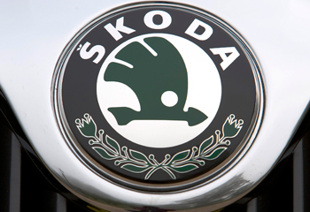
The Czech manufacturer which now exists under VW Group's ownership got its first logo when the company only produced bicycles using the Slavia designation. The badge was thus comprising the Slavia term plus the names of the two owners, Laurin & Klement. The first logo under the Skoda brand came out in 1926 and obviously included the Skoda name surrounded by an oval decorated with laurels. The popular “winged arrow” design was brought to life in the late '20s and was used for a long time, until 1990. It was believed to be the creation of commercial director of Skoda Plzen, T. Maglic.The current logo was adopted during the '90s and comprises the same winged arrow, now painted in green with black surroundings. The two colors are supposed to represent the company's interest for environment protection and its 100-year history, respectively.
SUBARU
Subaru's name is actually the Japanese translation of the Pleiades star cluster, which also means "to gather together". The six star logo represents the five companies that joined forces (Fuji Kogyo, Fuji Jidosha Kogyo, Omiya Fuji Kogyo, Utsunomiya Sharyo and Tokyo Fuji Sangyo) to form Fuji Heavy Industries (the biggest star in the logo).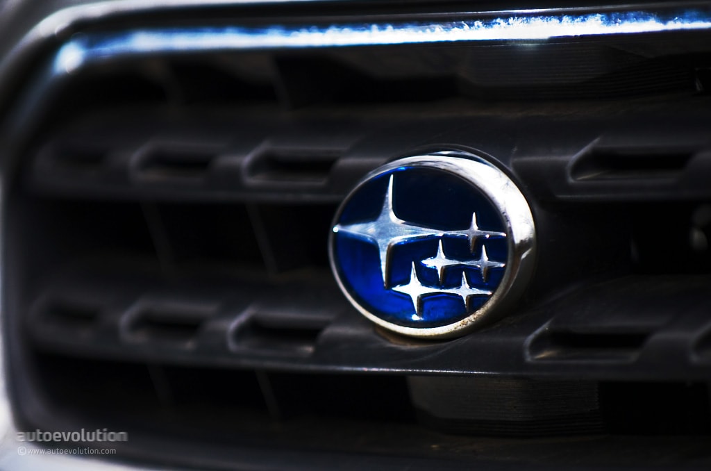
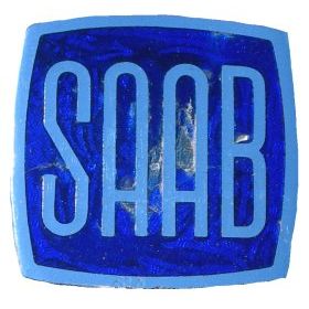
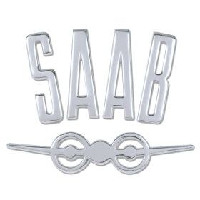
SAAB
SAAB, the Swedish carmaker now owned by the Dutch company Spyker, uses as a logo the coat of arms of the Count von Skane which also served as symbol for Skane, the Swedish province where Saab was initially based in. As you can see for yourselves, the badge shows a some kind of mythological bird that has the body of a lion but the head and wings of an eagle. It was actually based on Vadis-Scania's logo, the truck manufacturer that joined forces with Saab's parent manufacturer involved in the airplane manufacturing business.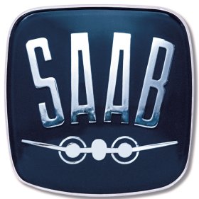
TOYOTA
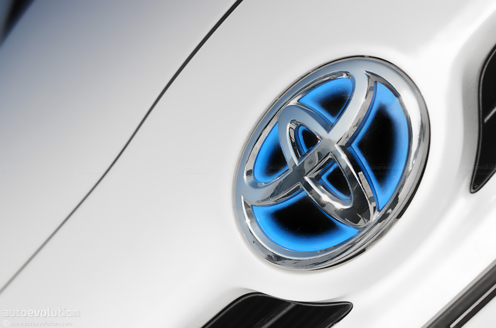
Although some of you would expect it, Toyota's logo has absolutely no connection to the stuck accelerator pedals affecting the Japanese company's models (no pun intended). The company's badge is actually made of three different ovals, two of which are said to stand for Toyota's relation with its customers. Furthermore, these two are also creating a symbolic "T" letter that comes from the brand's name.VOLVO
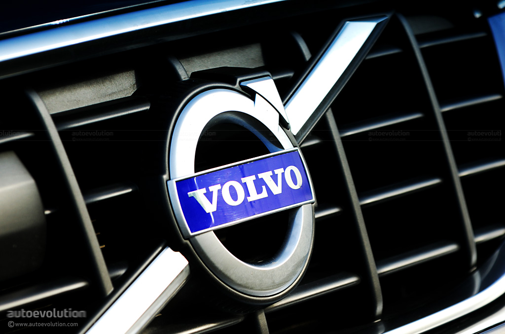
A symbol for safety and passenger protection, Volvo's name is inspired from the Latin word "volvere" which translates into "to roll". The badge however is the old symbol of iron but, according to some people, it also tries to transmit Volvo's "attraction" for safety technologies, which are often described to be as durable as iron.VOLKSWAGEN
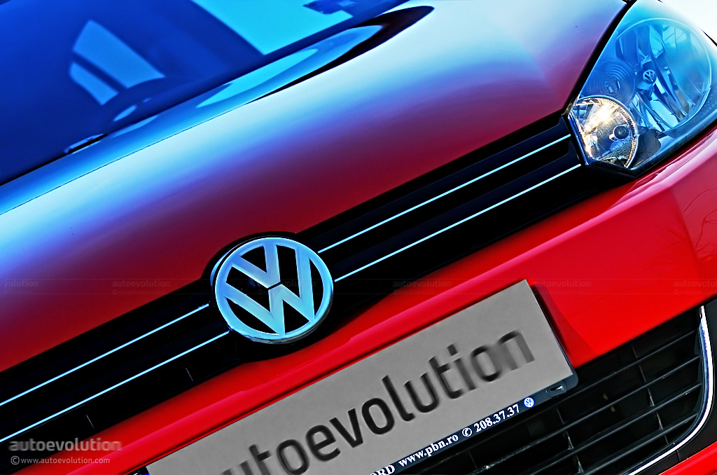
Volkswagen, one of the top players in Germany and in the whole world, has probably one of the most popular logos out there, seen on millions of cars sold in almost every corner of the Globe. There are multiple theories related to the the origins of Volkswagen's logo: one of them claims that it was designed by one of Hitler's friends during World War II while another suggests that it was the result of a design competition won by Franz Xavier Reimspiess, an employee of Porsche.