Apple is working around the clock on improving the experience with its Google Maps rival, and while new features are already rolling out, the company is also planning in advance and trying to come up with further innovations.
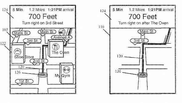
One of these ideas is detailed in a patent called “navigation application with novel declutter mode” and which was granted on January 31.
As anyone can figure out from its name, this new feature would have a very simple role: to simplify the user interface and put the focus entirely on the navigation experience.
If you use Google Maps and Waze on a regular basis, you certainly know that the interface can indeed be very cluttered at certain times. These applications are trying to show as much data as possible on the same screen, in some cases making it more difficult to notice the route directions.
Apple believes Apple Maps could do things differently, so the patent envisions a mode that can be enabled with the press of a button in the main UI.
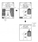
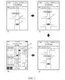
Once activated, this mode would remove all the visual items that users wouldn’t otherwise consider to be essential for the navigation experience, including buildings, landmarks, trees, and so on. The one that’ll remain in focus is the road ahead, as the route would be clearly highlighted on the screen all the time.
Apple says the new feature would work both in 2D and 3D navigation modes, and in some cases, the unnecessary items wouldn’t have to be removed entirely but only de-emphasized. Apple Maps could use a light shade of grey to display them, therefore highlighting the route that you must follow with the typical colors in an attempt to make it easier to observe.
Users would be provided with full control over what they want to see on the screen, so the configuration menu would allow them to set up the decluttered interface. Items like gas stations, landmarks, and buildings, all would be included in the configuration screen and can be displayed or not on the navigation screen based on users’ preferences.
The new approach would work both on mobile devices and CarPlay, and this makes perfect sense, as the navigation experience is primarily aimed at drivers. It would support the daytime mode, as well as the night theme, so the navigation screen would be simplified regardless of the time of day when you get behind the wheel.
Apple’s idea is in many ways a feature that would significantly make finding an address and following the right route more straightforward, especially when driving in places you don’t know. However, it’s important to keep in mind the whole thing is still in the patent stage for now, and this means there’s no guarantee it would ever be a part of the Apple Maps feature arsenal.
